The Gallery recently acquired a fine piece of late-nineteenth-century, Queensland-made jewellery — the D Mackay and Co. Gold and topaz bangle c.1900 (illustrated). Its making and provenance builds on an earlier Queensland piece already in the Collection — the Hogarth, Erichsen & Co. Archer mourning brooch c.1860 (illustrated). Together, these beautiful objects tell the historic stories of two Queensland families.
RELATED: Jewellery
The striking King family bangle was made by jewellers D Mackay and Co. in Cairns and originally acquired by Joseph Patrick King (1889–1942) for his wife, (Lilian) Eugenia Maud Hillson (1893–1978), at the turn of nineteenth century. Joseph King was born in Galway, Ireland, and worked for the Queensland Railway from 1906 to 1942.1 The King family settled in the north Queensland town of Charters Towers and the gold used in the construction of the bangle was most likely locally mined. Numerous goldfields were developed in the region during the late nineteenth century, encompassing Charters Towers and the Palmer, Hodgkinson and Mulgrave Rivers.
Mackay and Co Gold and topaz bangle c.1900


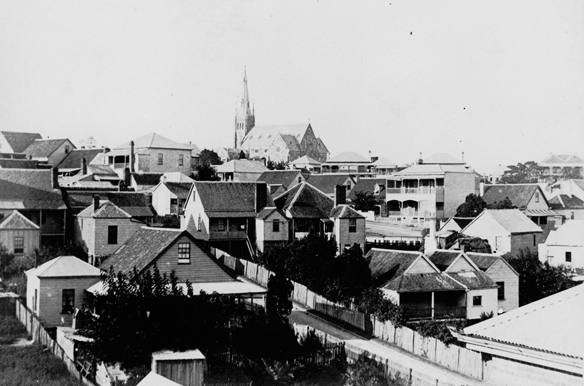
Charters Towers
The town of Charters Towers was founded in the 1870s when gold was discovered and rich deposits under the city were developed. During the boom years 1872-99 and following, the ‘Towers’ was Queensland’s largest city outside of Brisbane, boasting its own stock exchange and its own railway connecting to the coastal port of Townsville some 136 kilometres east.
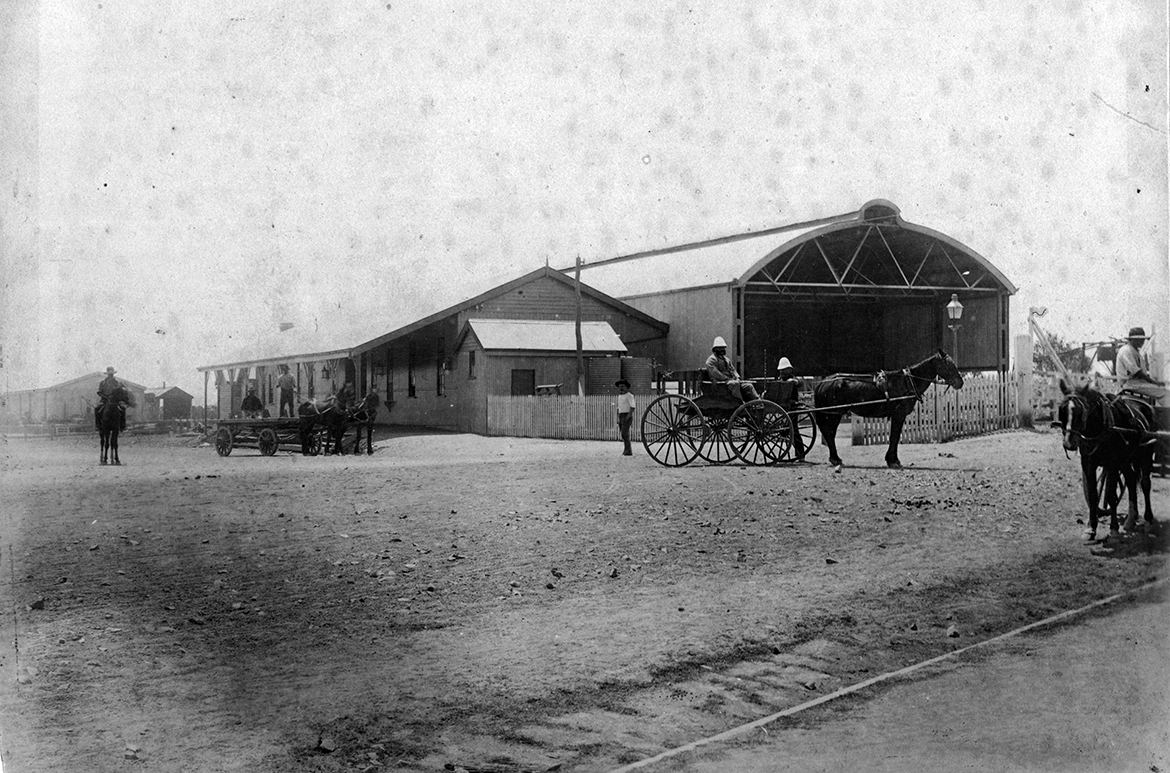
Charters Towers railway station
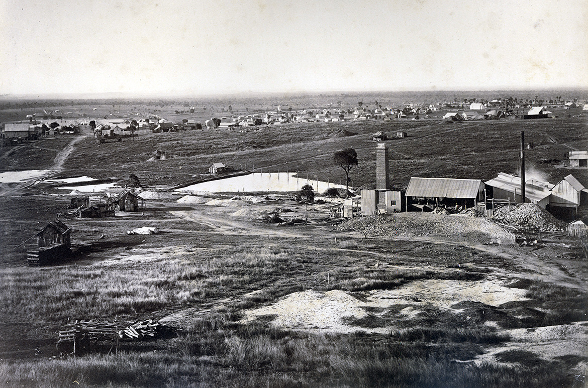
Charters Towers settlement
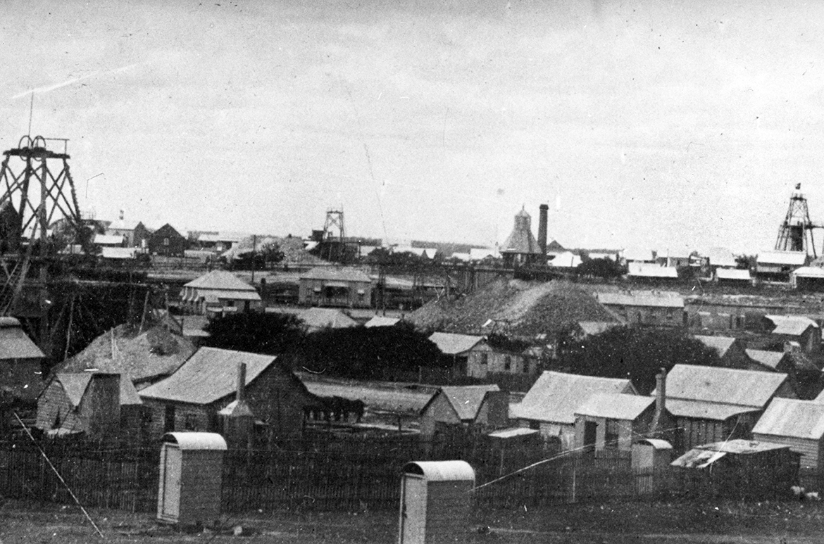
Charters Towers goldfields
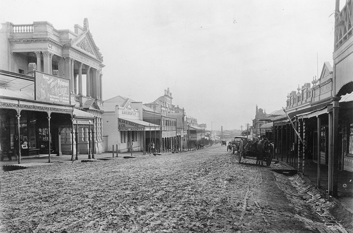
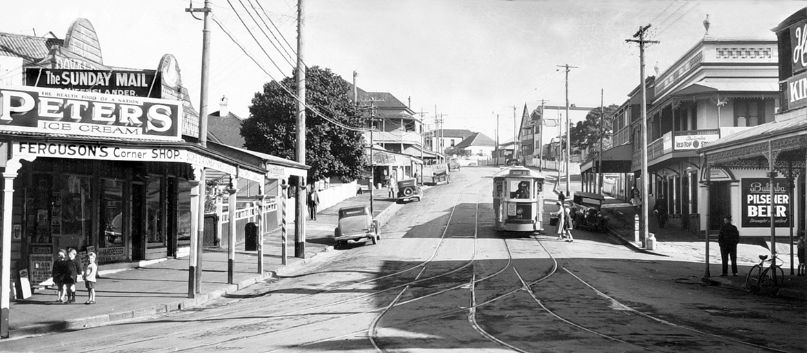
Business district, Charters Towers
The bangle’s refined design emphasises the natural radiance of its substantial cut-and-polished topaz. Topaz is found throughout Australia in the alluvial gravels (wash) of creeks and gullies with a history of volcanic activity. This impressive stone probably came from Mount Surprise, about 200km south-west of Cairns, between Mount Garnet and Georgetown. The nearby O’Brien Creek is also well-known for its gem-quality topaz.2 Topaz has a noteworthy history in Queensland jewellery, with gold-set brooches of white topaz found in Moreton Bay exhibited by Mrs Marsh in 1862, at the Queensland Court of the International Exhibition in London.3 At the Exhibition of Women’s Work in Melbourne in 1907, the Brisbane firm Flavelle, Roberts & Sankey exhibited a blue topaz said to be the world’s largest. It had been discovered in the hut of a north-Queensland miner, where it had been used ‘for shying at a neighbour’s thieving dog’. When first cut and polished, it had been submitted to King Edward VII in London for inspection, with a view to its inclusion in the new imperial crown. Owing to royal illness, the event did not take place and the topaz was returned to Australia.4
The makers of the King bangle, D Mackay and Co., were originally established in Brisbane in 1884 and opened a branch in Cairns in 1890, presumably to cater for the needs of the goldminers in the far north.
Hogarth, Erichsen & Co Archer mourning brooch c.1860
, Australia c.1854–65 / Julius Hogarth (Designer), Australia 1821–79 / Conrad Erichsen (Maker), Australia c.1825–1903 / Archer mourning brooch c.1860")
The outstanding gold Archer mourning brooch was made some 40 years earlier. It is attributed to Hogarth, Erichsen & Co. as it bears a strong resemblance to the massive and beautifully wrought brooches and bracelets made by the Danish-born sculptors Julius Hogarth and Conrad Erichsen during their partnership in Sydney from 1854 to 1861. The brooch was gifted by Alexander Archer (1828–90) to his mother, Julia, in Norway. Her husband, William Archer, was a trader in Scotland who lost most of his ships in the Napoleonic wars, and the family moved to Norway and set up in the timber trade. Julia had brothers in Australia, and in due course, all of their nine sons travelled here, while their four daughters remained in Norway.
Gracemere Station near Rockhampton


Charles Archer

In 1855, Alexander’s brothers, Charles and William Archer, established ‘Gracemere’ (illustrated) — a station outside of Rockhampton that remains with Archer descendants to this day — while Alexander was an early Bank of New South Wales gold buyer. The brooch was most likely made to commemorate the death of his brother, Charles, in 1861 (illustrated). Locks of hair beautifully arranged with seed pearls form a memento at its centre. Family lore relates that the gold for the brooch came from ‘Gracemere’. Alexander became the manager of the Bank of New South Wales in Brisbane in 1864, and Inspector in 1867. After 36 years of service, he left for England on the Royal Mail Ship, the Quetta, (illustrated) accompanied by his wife, Mary Louisa. Tragically, both were lost in the wreck of the ship on 28 February 1890 at the entrance to Torres Strait.5 The Quetta’s sinking killed 134 of the 292 people on board, making it one of Queensland’s biggest maritime catastrophes.
RMS Quetta in Brisbane in 1886

Isaac Walter Jenner painted the RMS Quetta in 1888

Hogarth, Erichsen & Co. were outstanding craftsmen who were intent on expressing an Australian identity with motifs derived from flora and fauna, including banksias, a native pear, ferns and palm trees, and the emu, kangaroo, sulphur-crested cockatoo, kookaburra, snakes, possums and lizards. The following description, which appeared in the Sydney Morning Herald of 9 July 1859, affirmed the quality of their workmanship:
As truthful illustrations of the natural history and floral beauties of the colony, nothing could be more perfect, the different objects whether quadrupeds, birds, foliage, fruit or flowers being truly lifelike. Never, perhaps in gold at least, has the plumage of the feathered tribes of Australia or the airy lightness of the flowers and ferns been displayed to such advantage, as in these chefs d’ouvre of art.6
Surviving examples of Australian colonial goldsmithing are rare due to there being few craftsmen working in the material and a small market. The Archer brooch has strong similarities to a marked example in the collection of the Museum of Applied Arts and Sciences, Sydney, with the use of a gold nugget, similar banksia, pod and bullrush motifs and similar effect of chasing.7 At the base of the brooch, a lizard is poised across two waterlily leaves, with a gold nugget. The ‘Gracemere’ homestead was built next to a large natural lagoon, and one wonders if the leaves’ inclusion points to the brooch having been inspired by the site.
Detail of lizard and waterlily leaves

These impressive pieces are so desirable in part for their beauty, but also because they have belonged to the same families since their creation. Both bangle and brooch have been used to commemorate significant events in their respective family’s lives. For the King family, the topaz bangle was a significant piece of jewellery worn at weddings and major social events; photographs supplied by the family of its members wearing the bangle enrich this narrative. It came down from Eugenia King to her daughter, Eunice, and then to her daughter, Margaret, for her wedding. The Archer family brooch, created as an act of family remembrance for a beloved son, was similarly passed through the maternal line thousands of kilometres away in Norway to Alexander’s elder sister, Catherine Jorgensen, to Mrs Valbourg Jorgensen, then on to Mrs Karin Anderson, who decided the brooch, which she loved, should return to Australia to her Archer family cousin, Mrs Alison Forster. Mrs Forster donated the brooch to the Gallery in 1990.
Michael Hawker is Curator, Australian Art to 1980, QAGOMA
Endnotes
1 Joseph King died of arsenic poisoning in 1942 as railway sleepers were, at that time, treated with arsenic to prevent white ant damage.
2 Queensland Government, ‘Northern Queensland fossicking’,
https://www.qld.gov.au/recreation/activities/areas-facilities/fossicking/north-qld/obriens-cre, viewed 16 October 2020.
3 Mrs Marsh was awarded a medal for her ‘turnery in myallwood’ in ‘beautiful bracelets consisting of beads turned in the sweet scented myall wood mounted in gold’. See Anne Schofield and Kevin Fahey, Australian Jewellery: 19th and Early 20th Century, David Ell Press Pty Ltd, Balmain, NSW, 1990, p.63.
4 Schofield and Fahy, p.148.
5 Obituaries Australia, Archer, Alexander, https://oa.anu.edu.au/obituary/archer-alexander-1448, viewed 16 March 2021.
6 Quoted in Schofield and Fahy, p.201.
7 ‘Gold brooch by Hogarth, Erichsen and Co.’, Museum of Applied Arts and Sciences, Sydney, https://collection.maas.museum/object/186427, viewed 1 March 2021.
#QAGOMA

 1951")

 c.1979")


 1977")

 c.1929")


 1975")
 1975")
 1975")
 1975")
