Conserving Jon Molvig’s works on paper


Passionate and rebellious, Helge John ‘Jon’ Molvig (1923–70) was a relentless artistic innovator, who, in the 1950s and 1960s, attained national recognition.

Newcastle-born, Molvig moved to Brisbane in 1955 and dominated the city’s art scene until his death just before he turned 47. With great energy, he created figure studies, portraits and landscapes, making radical stylistic shifts to suit his subject matter. Brisbane inspired Molvig’s greatest work, and it was from here that his influence spread.

On his return to Australia after serving overseas in World War Two, he studied art at East Sydney Technical College (1947–49). He then travelled throughout Europe until 1952, where he was influenced by the work of the German and Norwegian expressionists. By 1956, his unique brand of raw figuration was gaining prominence for its painterly intensity.

Molvig’s work is underpinned by superb draftsmanship and a commitment to the art of painting – a passion that inspired countless students in the late 1950s at his teaching studio at St Mary’s Anglican Church, Kangaroo Point, and Corroboree House, Spring Hill.

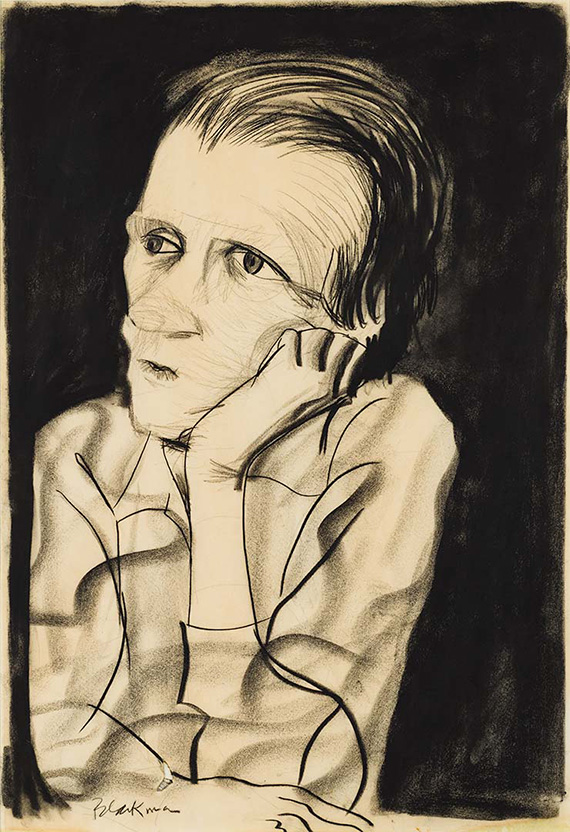
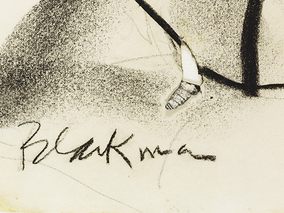
Jon Molvig Archibald winning portrait ‘Charles Blackman’

Jon Molvig, Australia 1923-70 / Charles Blackman 1966 / Oil on composition board / 121.7 x 105.5cm / AM & AR Ragless Bequest Funds 1969 / Collection: Art Gallery of South Australia, Adelaide / © Otte Bartzis

Molvig entered the Archibald Prize 13 times between 1952 and 1966, before winning with his portrait of artist–friend Charles Blackman. Reviewers proposed that Molvig merited the win on many prior occasions, to which the artist cynically responded: ‘the best portraits don’t win the Archibald’.

From the late 1960s, Molvig’s health began to fail, and he died in May 1970 soon after his body rejected a kidney transplant.

In her 1984 biography Molvig: The Lost Antipodean, Betty Churcher eloquently summarised Jon Molvig’s complex life and significant contribution to Australian art:

Because he has been so difficult to categorise, Molvig has often been overlooked by historians and curators . . . Yet, at the full stretch of his talent, he has produced images so powerful and urgent that they have that quality of all good art: they remain in the mind in all their original clarity.

RELATED: Jon Molvig: The power of expression

Challenges and discoveries

A maverick by nature, Molvig’s practice reflects his enthusiasm for experimentation, in which he stretched the capability of a diverse range of materials.

Before the treatment of any works on paper, we undertake extensive testing to determine the solubility of the degradation, and tailor a conservation rigid gel with customised reagents to address the needs of each artwork. These customised gels act as molecular sponges which, when placed in contact with the artwork, allow control of moisture within the paper. They efficiently target and make soluble staining and discolouration, drawing out and trapping it in the gel. As a result, these treated works have been improved both visually and physically; the original colour balance has been restored, and the artwork is stabilised so it can be appreciated long into the future.

Jon Molvig ‘The lovers’: Before conservation

Jon Molvig / The lovers (before conservation) 1955 / Brush and ink on paper on hardboard / 73.4 x 48.6cm (comp.) / Gift of Miss Pamela Bell 1989 / Collection: Queensland Art Gallery | Gallery of Modern Art / © Otte Bartzis

Jon Molvig ‘The lovers’: After conservation

The lovers 1955 after treatment with staining reduced / Photograph: Natasha Harth © QAGOMA

Behind-the-scenes

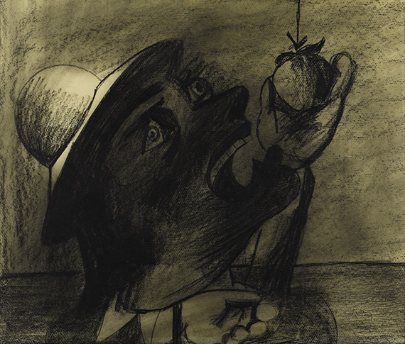
Samantha Shellard, Works on Paper Conservator and Adele Barbara, Paper Conservation Intern, share insights into using conservation gel technology to treat The lovers 1955 a brush and ink work on paper on hardboard. This large work bears the hallmarks of Molvig’s fruitful period in Brisbane, the brushwork is distinctive, looping strands of ink contain the composition giving a feeling of spontaneity that belies the carefully considered creative process.

The lovers had extensive deterioration consisting of distracting bands of dark discolouration. This deterioration resembled zebra striping across the couple, compromising the artist’s original intent by obscuring details and fine brushwork. Using a customised gel sheet slightly larger than the artwork meant that the disfiguring staining could be removed uniformly across the entire surface, which significantly improved the visual appearance of the work.

After treatment, The lovers is visually and physically improved, the original colour balance is restored and the artwork is stabilised so it can be appreciated into the future. 

In order to be a good painter in any field, it doesn’t matter whether it is non-objective painting or abstract painting or figurative painting, you certainly must be able to appreciate and understand line and tension, tone, and be able to put it down accurately as a draughtsman does. Jon Molvig

(Left to right) Adele Barbara, Conservation Intern and Samantha Shellard, QAGOMA Works on Paper Conservator during treatment of The lovers 1955
Degradation products are transferred into the conservation gel during treatment
During treatment / Photographs: J Ruckli © QAGOMA

Jon Molvig ‘Windows’

Jon Molvig / Windows 1951 / Gouache on cardboard / 70 x 102cm / Purchased 1983. Russell Cuppaidge Fund / Collection: Queensland Art Gallery | Gallery of Modern Art / © Otte Bartzis

One of greatest challenges was Windows 1951, a bright, primary-coloured artwork, which had an ugly grey fungal accretion covering almost a third of the surface area, predominantly throughout the large mottled blue rectangular section on the right-hand side.

This artwork was previously described as a gouache on cardboard. However, it was not until samples of both the accretion and blue paint, taken from different locations within the large blue building, were analysed using Fourier-transform infrared spectroscopy (FTIR) that suspicions were raised about its complex surface. The results revealed that this area was actually mixed media — there was evidence of gum Arabic binder, which is present in gouaches and watercolours, but there were also resin components that are found in oil paints.

Before treatment, showing the fungal accretion / Photograph: Natasha Harth © QAGOMA

The blue surface was literally a patchwork of different paint layers. After comprehensive testing and analysis of the fungal accretion, we devised a cleaning method that involved applying an isolating silicon solvent mask to protect the underlying gouache paint layer. We then applied a viscous gel containing reagents, which softened the accumulated accretion and drew it up from the surface of the work into the gel by capillary action.

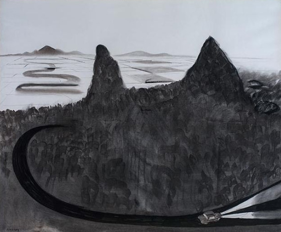
Jon Molvig ‘Burnt landscape’

Jon Molvig / Burnt landscape no. 1 (After the fire) 1953 / Oil on cardboard / 59.5 x 76cm / Purchased 2008 with funds raised through the Queensland Art Gallery Foundation Appeal / Collection: Queensland Art Gallery | Gallery of Modern Art / © Otte Bartzis

The conservation of Burnt landscape no.1 (After the fire) 1953 required a collaboration between painting and paper conservators, which resulted in the discovery of Molvig’s signature in the lower right-hand corner of the work, previously camouflaged by the old mounting. Layers of brown gummed tape had obscured it, as well as hiding compositional features from the perimeter of the work. This tape was painstakingly removed from all four edges of the work using humidification and an application of a gel poultice, with the residual adhesive removed in a separate procedure.

Burnt landscape no.1 (After the fire) 1953 undergoing conservation treatment / Photograph: Samantha Shellard © QAGOMA

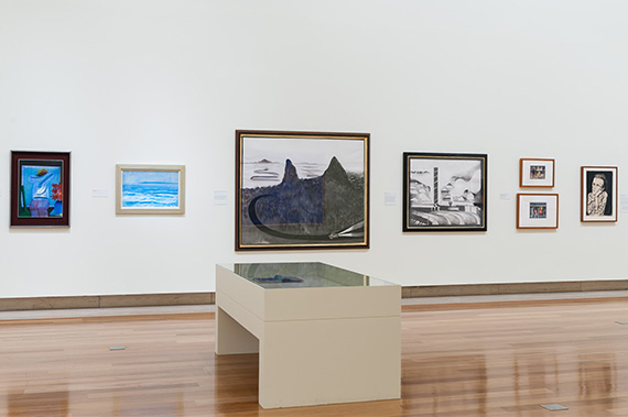
While these treatments were happening, our conservation framing team worked with curators to research frame mouldings from the period, and recreated profiles to complement the muted tones of the artist’s works. These conserved works are part of the ‘Jon Molvig: Maverick’ exhibition at the Queensland Art Gallery

Samantha Shellard is Conservator (Works on Paper) and Adele Barbara was paper conservation intern from January to September 2019. Jointly they presented ‘Challenges and Discoveries — utilising conservation gels to treat works on paper by Jon Molvig’ at the New Zealand Conservators of Cultural Materials (NZCCM) Conference on Modern & Contemporary Materials: Research, Treatment and Practice, 23–25 October 2019, at Christchurch Art Gallery Te Puna o Waiwhettu.

Buy the publication

Jon Molvig: Maverick explores Molvig’s contribution to the Brisbane art community, highlights his stylistic eclecticism, and revalues his unique contribution to art history. This richly illustrated, hardcover publication is available from the QAGOMA Store and online.

The QAGOMA Foundation has supported this conservation project investigating Jon Molvig’s working methods and the treatment of his works on paper in the Gallery’s Collection.

Feature image detail: Jon Molvig The lovers 1955
#QAGOMA

Expressive lines: Two drawings by Charles Blackman

 
BLOG-Blackman-Playground at night
Charles Blackman, Australia b.1928 / Playground at night c.1952 / Charcoal and crayon frottage on thin cream wove paper / 68.5 x 86.4cm / Gift of the Queensland Art Gallery Society 1985 / Collection: Queensland Art Gallery / © Charles Raymond Blackman. Licensed by Viscopy, Sydney, 2016

Significant funds raised during the QAGOMA Foundation’s Annual Dinner in 2014 enabled conservators to examine some of Charles Blackman’s works on paper. Two charcoal drawings, in particular, illustrate his dynamic talent.

Australian modernist painter Charles Blackman’s formative relationships with Queensland artists and writers were pivotal in his development as one of the country’s most prolific artists. Although primarily known for his painting, his charcoal drawings captured vivid imagery and were fundamental to his initial recognition.1

Blackman is considered a self-taught artist, although during 1942–45 he attended drawing classes at East Sydney Technical School, and later, life-drawing classes at the Sketch Club in Haymarket, Sydney, where his drawing style was described as, ‘if he were the other half of the duel and the paper had a rapier of its own’.2 When asked about his preference for graphic techniques, Blackman replied ‘I draw. That is what I love most of all. My interest in graphics has been through other people’s persuasion, to be frank’.3 He taught himself by observing other people’s works, including the imaginative illustrations of Odilon Redon.

BLOG-Redon-Centaur aiming at the clouds
Odilon Redon, France 1840-1916 / Centaure visant les nues (Centaur aiming at the clouds) 1895 / Lithograph on chine applique / Purchased 1980 / Collection: Queensland Art Gallery

Redon’s influence can be seen in the combination of dream and reality in Blackman’s ‘schoolgirl’ drawings.4 In Playground at night c.1952, an enormous upturned schoolgirl’s head blocks the path of two frightened girls, whose distress is captured in their scrawled, agitated forms. Evocative and economical in his use of line to convey emotion, Blackman attacks the paper, creating the giant, menacing schoolgirl whose contorted body merges with the shadows in the foreground.

Blackman has used both compressed charcoal 5 and wax crayon to heighten the work’s internal tension. Compressed charcoal is charred wood dust with a gum binder and is comparatively darker than vine charcoal. It is harder to erase and harder to smudge, but makes a darker mark. The medium comes in a range of formats: from pastel sticks, which Blackman has used here where the line is broad; to wooden pencils, which, due to the high portion of binder, results in a firmer core with a narrower, finer line. With it, he created the windows in this isolated streetscape, while the facial features of the threateningly large head, specifically the intimidating black pupils, were made using a heavy black wax crayon.

Felicity St John Moore has written that, ‘for Blackman as well as Redon, black was the essential colour of the mind’.6 This haunting image, reminiscent of the deserted urban landscapes of Giorgio de Chirico, also points to Blackman’s familiarity with the surrealists from his hours in the Carnegie Art Library.7 Brian Finemore praised him for his surrealist abilities:

By isolation, by concentration, by eliminating detail, by reducing the tonal range he intensifies a pictorial effect which compels us to look afresh . . . to become involved with the lost.8

BLOG-Blackman-School craving for an apple
Charles Blackman, Australia b.1928 / Untitled (schoolgirl craving for an apple) c.1951–53 / Charcoal and crayon frottage on thin cream wove paper / 52.7 x 61cm / Gift of the Queensland Art Gallery Society 1985 / Collection: Queensland Art Gallery / © Charles Raymond Blackman. Licensed by Viscopy, Sydney, 2016

Untitled (schoolgirl craving for an apple) c.1951–53 presents a primal figure, its mask-like face revealing rather than concealing its emotion. In an interview with Thomas Shapcott, Blackman described his subject: ‘My schoolgirls wear bullet-proof vests. Their skirts are parachutes of sex. Under their mushroom hats, their eyes are laced with black laces’.9 Here, Blackman has captured the anxious anticipation of ‘the bite’, while the heavy application of charcoal over the entire surface of this work forms an almost impenetrable shadow.

Blackman used rolled architectural detail paper for both of these drawings. When speaking with Thomas Shapcott, Blackman explained why he switched to rolls of paper, stating that ‘The basic thing was portability, no weight’.10 Although detail paper is smooth, he used a frottage technique to create rough, grainy background textures. From the French frotter, ‘to rub’, the technique was initially exploited by Max Ernst and then developed further by the surrealist artists, who would ‘lift’ textures onto the paper from beneath, with the texture of a wooden floor, string or leaves being transferred by the pressure of the drawing medium. In this case, the texture was most likely formed by rough cardboard.11

Throughout his career, Blackman gained expertise in many media through his drawing practice. From these two drawings alone, it is possible to appreciate his brilliance.

Endnotes
1 Felicity St John Moore, Charles Blackman: Schoolgirls and Angels – A Retrospective Exhibition of Paintings and Drawings by Charles Blackman [exhibition catalogue], National Gallery of Victoria, Melbourne, 1993, p.35.
2 Moore, p.15.
3 James Gleeson interview with Charles Blackman [transcript], 26 April 1979, James Gleeson Oral History Collection, National Gallery of Australia, Canberra, 1979, p.11.
4 Moore, p.1.
5 In his interview with James Gleeson, Blackman states: ‘The medium that I always use when I say “crayon”, is actually compressed charcoal. I always use the one thing. When I say “crayon” I am not being accurate. It should be ‘compressed charcoal’ all the way through unless charcoal is specified’, p.16.
6 Moore, p.2.
7 Moore, p.16.
8 Brian Finemore, National Gallery of Victoria Annual Bulletin, 1961, p.23. Cited in Moore, p.58.
9 Thomas Shapcott, 1966. Cited in Moore, p.44.
10 Thomas Shapcott, The Art of Charles Blackman, Andre Deutch, London, 1989, p.18.
11 Blackman was purchasing cardboard to paint on during this period, as he recounts in his interview with James Gleeson. ‘Also, I had a bit more money because I had sold a picture. I actually had twenty pounds. So I went to a place and bought 50 sheets of cardboard . . . it would have been 1952’, p.13.

Subscribe to YouTube to watch behind-the-scenes footage and exclusive interviews / Read more on our blog

Samantha Shellard is Conservator, Works on Paper, QAGOMA

Lyrical Lines: Examining two Drawings by Charles Blackman

 
blog-1987.028_001
Charles Blackman, Australia b.1928 / George Johnston c.1964 / Charcoal on wove paper / Gift of Miss Pamela Bell in honour of Marjorie and Brian Johnstone 1987 / Collection: Queensland Art Gallery / © Charles Raymond Blackman c.1964. Licensed by Viscopy, Sydney, 2016

The preparation of artworks by Gallery Conservators for the exhibition ‘Lure of the Sun: Charles Blackman in Queensland‘ offered an opportunity to observe Blackman’s deliberate selection of certain materials and techniques to depict his subjects.

This exhibition explores Blackman’s formative relationships with Queensland artists and writers that were pivotal in his development as one of Australia’s most prolific and profound artists. Here we discuss two charcoal drawings featured in ‘Lure of the Sun’.

Although primarily known as a painter, it was his charcoal drawings which were fundamental in his initial recognition within the Melbourne art scene. In 1986, when gifting George Johnston c.1964 into the Gallery’s Collection, Pamela Bell said

I consider it to be a drawing of Charles at his best, it is a drawing of the greatest command of technique and insight into George

And indeed this drawing is a compelling portrait with a range of exquisite techniques. The sitter is framed by a dense sumptuous velvet background created by the application of willow charcoal.

blog-1987.2
Detail of Charles Blackman’s George Johnston, in raking light showing the sumptuous velvet background of the soft willow charcoal / Photograph: Natasha Harth

Blackman used the sides of the willow stick to create an undulating ripple of the fabric and few lines to form the soft folds in the shirt. Willow charcoal is made from natural willow which is cooked in a low oxygen environment so it doesn’t disintegrate into ash. Willow charcoal is very soft to use and broad sticks are fantastic for fast coverage of large areas. Although it can be easily removed, it does not adhere particularly well to the paper surface, so it is very vulnerable to smudging. The background in this drawing is unfixed and has fortunately retained its luscious and tactile surface. In preparation for ‘Lure of the Sun’ we reframed this work with museum grade low static laminated glazing to preserve its beautiful surface.

The fine loose vine charcoal lines of his wistful eyes capture a sombre contemplative mood. Vine charcoal is also natural charcoal however it is harder than willow charcoal and harder to erase. It makes a fairly grey black, which can be seen in the paler wrinkled lines surrounding George’s face.

blog-1987
Detail of George Johnston showing the serrated edge of the detail paper / Photograph: Natasha Harth
blog-1987.3
Detail of George Johnston showing the light weight paper in the tear produced while creating the portrait / Photograph: Natasha Harth

The drawing of George Johnston is on architectural detail paper. There is an overall discoloration, which is due the inherit nature of paper made from ligneous wood pulp which degrades with age. The characteristic serrated edge of the detail paper torn from the roll is only visible when you lift the window mount and there is a small tear in the lower left hand corner formed during Blackman’s energetic drawing of the sitter, and shows just how thin and light weight the detail paper really is.

blog-BLACKMANcharles_RoundtheMountain_PhilipBaconGalleries_CarlWarner_002
Charles Blackman, Australia b.1928 / Round the mountain and across the field c.1978 / Charcoal on paper / Courtesy: Philip Bacon Galleries, Brisbane / © Charles Raymond Blackman, c.1978. Licensed by Viscopy, Sydney, 2016

Round the mountain and across the field c.1978 is an impressive drawing due to its ambitious size. Blackman used a single large sheet of light weight card. Given its size it has been necessary to roll the work in order to transport it and as a result the image has sustained handling creases throughout where it has been flatten prior to being framed. The soft willow charcoal has been utilised here to create a claustrophobic environment. The small car in the lower right corner is dwarfed by the surrounding landscape and towering mountain range. The car’s head lights struggle in a perilous winding journey as the forest encloses in from all sides.

blog-QAG_LureOfTheSun_installationview_201501112_nharth_015
Installation view of ‘Lure of the Sun: Charles Blackman in Queensland’

Appreciate the brilliance of Charles Blackman and view these drawings for yourself. ‘Lure of the Sun: Charles Blackman in Queensland’ is at the Queensland Art Gallery until 31 January 2016 and is accompanied by a richly illustrated monograph featuring three essays exploring Blackman’s years in Queensland, focusing on the artist’s creative friendships with painters and poets, his connection with the young artists of the Brisbane-based Miya Studio and Barjai writers, and revealing the findings of recent conservation research into the artist’s materials and techniques.

Author George Johnston is best known for his semi-autobiographical novel My Brother Jack, published in 1964, which won the Miles Franklin Award that same year.

In 1986, Queensland poet Pamela Bell gifted to the Gallery Jon Molvig’s 1957 portrait of Blackman, and then, the following year, Blackman’s drawing of Johnston. These gifts recognised the contribution of Brisbane commercial gallerists Marjorie and Brian Johnstone to contemporary Australian art in Brisbane, and to Blackman’s career.

Bell wrote of Blackman’s work:

… It represents for me a time of mutual friendship between us all . . . and commemorates a memorable lunch, the Blackmans, Judith Wright, George and I, so again it is in the tradition of the works I am in the process of gifting to the Gallery, which in differing ways are about friendships and eras in the cultural life of Queensland.

Subscribe to YouTube to watch behind-the-scenes footage and exclusive interviews / Read more on our blog

Samantha Shellard is Conservator, Works on Paper, QAGOMA

Experience the Journey: Bea Maddock’s TERRA SPIRITUS…


To truly appreciate the epic work that is TERRA SPIRITUS … with a darker shade of pale 1993–98 (illustrated), you must immerse yourself and absorb this expansive installation which reaches almost 40 metres in length. This work has been described as Bea Maddock’s ‘Magnum Opus’1, indeed it is the accumulation of not only years of dedication producing the actual editioned suite of 5, but a career of refining her practice. 

Bea Maddock ‘TERRA SPIRITUS … with a darker shade of pale’ (details) 1993-98

Bea Maddock, Australia 1934-2016 / TERRA SPIRITUS … with a darker shade of pale (details) 1993-98 / Incised drawings, worked with hand-ground natural pigments over letterpress and finished with hand-drawn script on Magnani paper / 51 sheets: 28.3 x 76cm (each); title page: 28.3 x 76cm / Purchased 1999. QAG Foundation Grant / Collection: Queensland Art Gallery | Gallery of Modern Art / © Bea Maddock

This work has the ability to transport you mentally to the rugged coastline of Tasmania, where you will find yourself enveloped by an ochre sea within a chorus of European and Indigenous voices as they recite place names of the panoramic shoreline. TERRA SPIRITUS … charts the coastline of Tasmania as seen from the sea. The artist had originally intended to produce this work by surveying the coast from a boat and then circumnavigating the island, but this proved impractical so she devised a method of using pre-existing topographical maps.

I quite like the idea of the work wrapping around you.
You see the whole thing at once which I think is important
Bea Maddock

The success of this artwork operates on several layers both in terms of its technical expertise and the evocative nature of the ochre. You can admire it on both a micro and macro scale; admiring the exquisite detail of the finely incised coast line within the individual panels and then take in the massive vistas as you scan cliffs and bays around the gallery space. As Bea Maddock describes, the journey around the island is quest of personal understanding.

If you move in a circular direction you come back to the place where you started the long way round 2
Bea Maddock

One of the most fascinating aspects in my role as paper conservator is gaining an intimate understanding of the physical nature and creation of art held within our Collection. Condition reporting involves close scrutiny of the tactile surface. I was mesmerized by Maddock’s technique which involved painstaking methods using a combination of incised lines, meticulously cut stencils and blind letterpress.

Raw Materials used for grinding and creating ochre pastels / Courtesy: The making of TERRA SPIRITUS… with a darker shade of pale 1993–98, produced by the Queen Victoria Museum and Art Gallery, Launceston, 1999
Testing the ochre from the raw ochre / Courtesy: The making of TERRA SPIRITUS… with a darker shade of pale 1993–98, produced by the Queen Victoria Museum and Art Gallery, Launceston, 1999

Maddock is the ‘quintessential maker’ where she experiments and pushes the medium to make eloquent statements. I was fascinated by the comprehensive text which accompanies the production of this suite. The creation of this installation was an enormous undertaking starting from 1993 until 1999.

Incising the landforms using the transparency as a template / Courtesy: The making of TERRA SPIRITUS… with a darker shade of pale 1993–98, produced by the Queen Victoria Museum and Art Gallery, Launceston, 1999
Draft of European names alongside the completed blind printed letter press / Courtesy: The making of TERRA SPIRITUS… with a darker shade of pale 1993–98, produced by the Queen Victoria Museum and Art Gallery, Launceston, 1999
The setup “type” / Courtesy: The making of TERRA SPIRITUS… with a darker shade of pale 1993–98, produced by the Queen Victoria Museum and Art Gallery, Launceston, 1999

It is enthralling to read about her creative practice and gain greater insight into her working methods; to comprehend the numerous decisions made and exactly how her concepts evolved. She undertook the collection, grinding and grading of the ochre and carefully created tonal variations for the coastline.

Checking the tone on the landforms with tone scale / Courtesy: The making of TERRA SPIRITUS… with a darker shade of pale 1993–98, produced by the Queen Victoria Museum and Art Gallery, Launceston, 1999
Applying the first layer of ‘sea’ ochre / Courtesy: The making of TERRA SPIRITUS… with a darker shade of pale 1993–98, produced by the Queen Victoria Museum and Art Gallery, Launceston, 1999
Making the script for the Aboriginal names / Courtesy: The making of TERRA SPIRITUS… with a darker shade of pale 1993–98, produced by the Queen Victoria Museum and Art Gallery, Launceston, 1999
Scripting the Aboriginal names from the script draft / Courtesy: The making of TERRA SPIRITUS… with a darker shade of pale 1993–98, produced by the Queen Victoria Museum and Art Gallery, Launceston, 1999

‘So it must be hung without any visible means of support’ 3 To display this work as a continuous frieze, each panel is butt up against the next. The individual drawings of ochre have been treated with 4 layers of fixative, so although they have retained a velvety texture the pigment is well bound to the surface. The mounting system for our suite was devised in 1999.

This consists of mount board backing which has 2 rows of Velcro strips adhered to the back for each panel. On the back of the individual artwork panels were pasted Japanese tissue hinges along both the top and lower edges. These hinges were wrapped around the edges of the smaller mount board backing and secured in place. Each panel was mounted onto the corresponding hook side Velcro which were stapled to the gallery walls.

Mounting system for TERRA SPIRITUS … with a darker shade of pale 1993–98 with velcro strips adhered to the backing board
Bea Maddock with TERRA SPIRITUS … with a darker shade of pale 1993–98 / © QAGOMA

Endnotes
1 Kate Ravenswood, ‘A complicated edge: Bea Maddock’s TERRA SPIRITUS… with a darker shade of pale 1993-1998 , Brought to Light II: Contemporary Australian Art 1966-2006 from the Queensland Art Gallery Collection, Brisbane 2007, p.248.
2&3 Bea Maddock (Journal 1983 entry between leaves dated 23.2[1983] and 31.3.83)

#QAGOMA