On display in the Australian Art Collection, Queensland Art Gallery (Josephine Ulrick and Win Schubert Galleries), Photographic machine 1968 (illustrated) by Australian artist Erica McGilchrist — whose career can be defined by the freedom with which she explored different styles and directions — was a passionate activist for women’s art, and ahead of her time.
Erica McGilchrist was highly regarded as an artist and educator, celebrated for her contributions to modernism in Australia from the late 1950s until her passing in 2014. She was born in Mount Gambier, South Australia, in 1926 but for most of her career lived and worked in a studio in the Melbourne suburb of Caulfield, creating countless paintings, works on paper and embroideries.
McGilchrist was a passionate activist for women’s art. In 1975 she co-founded the Women’s Art Register, which she coordinated until 1986, and she was widely acknowledged as an important community figure for this advocacy. She was awarded the Order of Australia Medal in 1992 for her outstanding contribution to the women’s art movement and in recognition of her own art practice. The Register is now housed at the Richmond Public Library in Melbourne and holds reference material on more than 5000 Australian and international women artists.
A period of study at the Akademie der Bildenden Kunste in Munich from 1960–61, made possible by a scholarship from the German Academic Exchange Service, was integral to McGilchrist’s development and also enabled her to exhibit in both Munich and London before returning to Australia in 1964. Yet it was more than having access to the climate of artistic innovation in Europe that shaped the artist at this time. Her travel was said to have come with strained romantic relationships in Australia and Europe, and the resultant emotional burden may have also prompted McGilchrist to experiment and invent freely.1 Improvised and uncensored, she held a deepening interest in surrealist automatism, as well as various modes of lyrical abstraction and figurative expressionism. In many respects, this sense of freedom continued throughout McGilchrist’s career — and perhaps even defines it. Linda Short, curator of the artist’s 2013 survey at Heide Museum of Modern Art, says that
McGilchrist typically allowed the mood or meaning informing her images to dictate her stylistic approach. As a result, she worked fluidly between abstraction and figuration, and often combined both modes in the one picture. . . McGilchrist’s ability to invoke feelings and states of mind through formal means is one of the strengths of her art, yet she always balanced the emotive tenor of her work with an intellectualism.2
McGilchrist was arguably ahead of her time in taking such latitude and giving herself the necessary space to develop her interest in the human psyche, exhibiting more in common with postmodern artists of the late 1970s and 1980s than her immediate peers in the 1960s. Moreover, her engagement with broad feminist concerns — and her interest in the relationship between the individual and society — makes her work particularly relevant today.
For all McGilchrist’s fluid tactics, Photographic machine 1968 is a keenly resolved painting, with a clear design sensibility owing to an economic use of colour, line and pattern. Her repeating bars — and use of clean, straight lines in general — makes a skilful contrast against the sparing use of curves that denote two arms and a head engaged in the choreography of taking a photograph. In this balance of abstraction and representation, formal clarity and colour harmonies, Photographic machine has something in common with a particular European modernist sensibility, as found in the wit of Sophie Taeuber-Arp’s earlier take on Dadaism.
It is evident in her eloquence and clarity that McGilchrist delighted in her aesthetic explorations — both in Photographic machine and indeed throughout her career. While her works were broad in shape, her thoughtful character remained ever present.
Peter McKay is Curatorial Manager, Australian Art, QAGOMA
This text is adapted from an essay first published in QAGOMA’s Members’ magazine, Artlines.
Endnotes 1 Linda Short, ‘Erica McGilchrist’, Monash University Museum of Art, <https://www.monash.edu/muma/collection/level-2-page/Firstlanguages-of-the-Collection/2019/Erica-McGilchrist>, viewed June 2019. 2 Short, ‘Erica McGilchrist’.
Australian artist Michael Zavros has made a significant impact on the Australian art world through the artist’s multi-decade practice. He has created depictions of luxury and beauty and works inflected with humour and ambiguity that challenge the mind and please the eye, prompting the viewer to consider their own values.
Over 25 years of a rigorous practice, multidisciplinary artist Michael Zavros’s singular view of contemporary culture has attracted international recognition. His sought-after works explore worlds of luxury, even decadence, and are often filled with beauty. They convey a sense of desire and, more subtly, the artist’s reflections on identity. Glamorous depictions of idealised figures, stylish fashion, spectacular interiors, whimsical landscapes, purebred animals and playful still lifes are rendered with a painstaking precision and entrancing attention to detail that evokes the richness of his subjects. Raised in the Gold Coast hinterland and now residing in Brisbane, Zavros’s work is not without a challenging streak; many of the artist’s most successful gestures use humour and ambiguity to entertain a deeper meaning and prompt audiences to consider their own values and the broader patterns of society and the individual. Curiously, though Zavros is known primarily as a painter, he appears to reveal more about himself in his photographic, sculptural, video and relational artworks.
The exhibition, ‘Michael Zavros: The Favourite’, began with a selection of insightful yet divergent explorations of contemporary masculinity, starting with his early ‘suit’ miniatures (illustrated Adam’s Apple 2000). Painted when Zavros was in his mid-twenties and still dreaming of the success that he would soon manifest, these contrasty, luminous panels take reproductions of fine tailoring and handcrafted footwear from fashion magazines and imbue them with the aura of a religious icon. Driven by devotion to lofty ideals, these works remain slightly impersonal — as if expressing a desire to be stylish, even beautiful, but also insulated from any pointed questions of self-hood by this veil of appearance. Nearby, the large sleek charcoal ‘Debaser’ drawings (illustrated Debaser/Polka-dot 2010) iterate this sentiment by depicting headshots of male models wearing the collars of high fashion houses, but with their faces significantly erased. This desire to construct a glamorous self that is free from any individual feature that could be descended on as a fault or failure quietly plays a heart-rending aspect of being judged for appearances — or even singled out and victimised for any intrinsic characteristic.
Despite their rugged, outdoorsy content, the ‘Prince/Zavros’ series (illustrated Prince/Zavros 6 2012) is in some respects a more cerebral exercise. Inspired by the North American conceptual artist Richard Prince’s ‘Cowboy’ works of the late 1980s, or at least, the record-breaking prices they have commanded at auction, Zavros reproduced by hand Prince’s own photographic appropriations of Marlboro advertisements. While Prince played with the potent symbolism, mythology and ubiquity of the iconic Marlboro Man within a media-saturated landscape, in appropriating Prince, Zavros ponders the life of the image, placing additional emphasis on its transition from studio to art market. Yet it is equally possible that Zavros is more sincere than Prince himself in his affection for the rugged cowboy mythology, demonstrating the tendency for North American culture to supplant the Australian experience.
The ‘Dad’ mannequin photographs (illustrated Dad likes winter 2020) present a series of unguarded moments made uncanny to explore a sense of alienation and even depersonalisation. Zavros printed a three-dimensional likeness to stand in for him doing his favourite things, like spending time with his family at the beach, or driving his prized English Red Mercedes. Inspired by a complex range of sentiments, these images address a desire to embody the taller, broader, smoother body spawned by social media expectations, and a more sinking preoccupation with the feeling that one’s interests, and even one’s very presence, might be broadly interchangeable within a certain demographic or cultural group. However, the ‘Dad’ figure is also about the constructions of self that happen beyond our reach — as Zavros experienced when he started gaining media attention for his success. As curator and writer Robert Leonard notes, Michael ‘and his curator-writer wife Alison Kubler became Instagram celebrities, society-page staples, wormholes between the garret and the gala. Everything Zavros did seemed to be news’.1 This attention gave Zavros’s second self an oddly alien character that was largely unrecognisable to him and his loved ones – and in part, it is to this gap of recognition that Zavros gives image. Beyond the gesture itself, it’s worth noting the sad irony that this monotone dummy appears to yield a more nuanced appreciation of contemporary masculinity than many dominant mainstream narratives currently do.
In one gallery space, the works consider ownership and the trophy phenomenon in fine grain; the way in which special classes of capital also act as social currency. On the walls at the centre of three large and lavish monochrome interiors, Zavros has painted artworks by the very recognisable and coveted Australian artists Emily Kame Kngwarreye, Dale Frank (illustrated 1820s Regency leather sofa/Favela chair/Champion Dachshund ‘Windkiedach Wiggle’/a Dale Frank 2008) and Bill Henson. In this context, the artworks take on a ‘designer’ aspect, their intended meaning slightly subsumed by the luxury of their surroundings, operating instead as emblems of the absent owner. A more nuanced reading might recognise that these works could also play backdrop to various domestic scenes: time spent resting or recuperating, sharing meals, studying, or any number of life’s joys and pains. While it might seem obvious that evocative artworks can enrich a collector’s private life, these interiors challenge the art-world presumption that the ideal experience of a work of art is in a neutral public space: accessible, but distinctly isolated from everyday existence.
Alongside these works appears a selection of Zavros’s dramatic equestrian paintings, drawings and sculptures (illustrated Trophy 2010), which show the power (and vulnerability) of thoroughbreds; quixotic images of the rare Japanese Onagadori chicken (illustrated White Onagadori 2006) with its stunning but impractically long tail; and small paintings of European palaces such as Hanover’s Gartensaal and Sanssouci in Potsdam, which the artist has infused with sense of outdated opulence (many of these having been painted, literally, from the faded pages of old books). These works can be read in terms of possession and ambition, but also devotion and fragility. This facet of Zavros’s practice culminates in spectacular paintings in which gleaming bodybuilding equipment appears within the pinnacles of Western magnificence: the Palace (illustrated Echo 2009) and Trianon (illustrated The new Round Room 2010–12) at Versailles. The scenario conjures a mischievous absurdity that points to a darker undercurrent of extraordinary power in extreme isolation, perceiving something of our increasingly stratified class structure and its recurrence throughout history. As Zavros explains,
I wanted to create something that had a post apocalyptic feel. Something that was joyous and celebratory and glittery, but also at the same time ominous, with an air of foreboding . . . For The new Round Room I cast myself as the new Sun King occupying and decorating the strange theme park that is Versailles . . . a folly within a folly.2
Zavros’s Narcissus-themed self-portraits are arguably his most iconic gestures, V12/Narcissus 2009 and Bad dad 2013 (illustrated), especially. Their impeccable, seductive surfaces reward our close attention, while intelligently updating the terms of reference for the ancient Greek myth about the relationship between the love of self and love of others. Zavros, however, is largely ambivalent about moral interpretations of his work; from that perspective, the images are more about recognising the aspirational yet insulating character of our contemporary culture — meditations on consumer meditations — than intended to stoke a fervent critique of consumerism and excess.
Reflections of the artist also appear in his depictions of his children — Phoebe, Olympia and Leo. Phoebe (illustrated Phoebe is 11/Linda Farrow 2017) is a natural performer, interested in fashion, make-up and role play. Many works featuring Phoebe explore ideas of identity construction and coming of age. Olympia also appears, though less frequently; she’s more interested in being behind the easel or camera, or a drum kit. Leo distinguishes himself with a surprisingly versatile air of ‘rebel without a cause’. These paintings (and occasional photographs) are complex. They can be read as revealing intimate aspects of family life, yet in many respects, are intended more lightly: observational, but playful. Phoebe, Olympia and Leo aren’t necessarily playing ‘themselves’; instead, they play characters invented in collaboration with Zavros. The temptation to ponder questions about responsible parenting or, again, the moral climate in which children are raised today, should play relatively faintly.
In recent years, still life has been a pillar of Zavros’s practice. We see opulent arrangements of fruits and flowers, seashells and vases on pristine white canvases conjure all kinds of animals from poodles to peacocks, and from giant pandas to the mythological Phoenix (illustrated The octopus 2014). These works recall the fantastical proto-surrealist portraits of sixteenth-century Italian painter Giuseppe Arcimboldo, who often fashioned his subjects from clever compositions of vegetables. Whereas Arcimboldo’s approach was dark and grotesque, Zavros’s is light-filled and light-hearted, overtly operating at surface level. In this way, his still lifes are less about trickery or illusion and more a pure game or joke, consciously walking the limits of artifice, painterly skill, and the construction of meaning.
The exhibition concludes with a large-scale mural, filling GOMA’s Gallery 1.2. Titled Acropolis now 2023, the work is an invocation of the great achievements of Greek society and culture, framed through the distance of time. Here, it provides a backdrop for awareness of cultural repatriation movements, and references a certain locus of community gatherings, recalling the Greek cafes and clubs that his father frequents. Extending the ambiance, backgammon tables invite the audience to linger, learn the game and socialise.
Despite a fixation on outward appearances and investment in the surface level, Michael Zavros plumbs a multitude of emotional and psychological depths. In that regard, it is not so surprising that Zavros prefers to say little about his work, other than to encourage an open-ended interpretation and to temper the desire to quickly ascribe a critical view. While our relationship to his subjects can be complicated, perhaps our appreciation for his themes of beauty and family, and his penchant for self-reflection, need not be.
Peter McKay is Curatorial Manager, Australian Art.
Endnotes 1 Robert Leonard, ‘The devil’s in the detail’, in Michael Zavros: The Favourite, QAGOMA, Brisbane, 2023, pp.64. 2 Michael Zavros, quoted in Mariam Arcilla, ‘Michael Zavros: Capturing the Prince’, Vault, no.3, April 2013, p.77.
‘Michael Zavros: The Favourite‘ in 1.1 (The Fairfax Gallery) and 1.2 was at the Gallery of Modern Art (GOMA) in Brisbane from 24 June to 2 October 2023. This exhibition offered opportunities for dialogue with ‘eX de Medici: Beautiful Wickedness’ presented in the adjacent gallery 1.2 and 1.3 (Eric and Marion Taylor Gallery).
Margaret Worth’s Untitled 1968 (currently on display in the Australian Art Collection, Queensland Art Gallery) is a striking example of hard-edge abstraction by one of Australia’s outstanding abstract artists. This rare modular structure tests the boundaries of painting and sculpture in a melding of colour and form.
In the mid to late 1960s, Margaret Worth was making important contributions to the advancement of abstract art in Australia. At the time, however, this was poorly acknowledged, in part because of her relocation to New York in 1969 — where she later received a Master of Fine Arts from the prestigious Columbia University — but more significantly because women’s cultural contributions were still routinely sidelined in this era.
Worth would have been an obvious and excellent candidate for ‘The Field’, the landmark exhibition of hard-edge abstraction in Australia, hosted by the National Gallery of Victoria in 1968, but she was inexplicably overlooked. Her work was fabricated to exacting standards and with fine attention to detail in the design and grade of her materials. Thankfully, Worth’s work from this period survives in good condition for this commitment to quality and her self-belief.
Primarily known for her bold paintings of flowing bands of pure colour, Worth’s most challenging and rewarding gestures from this era are arguably her modular structures, such as Untitled 1968 (illustrated). Testing the boundaries of painting and sculpture in a melding of colour and form, Untitled is a comparatively rare two-unit work that projects prominently from the wall. The economy of this multifaceted escape from the conventions of painting yields an astonishingly pure yet complex experience.
Painted a uniform blue on the outside and facing edge, and complemented by an orange interior, under gallery lights the work casts a warm blush on the ‘empty’ central space, surrounded by a cooler-toned halo. The innovative and bewitching result calls into question the parameters of the object by breaking free of its perimeters.
Margaret Worth, Australia b.1944 / Untitled 1968 (various views)
Influenced by her earlier studies in music, physics, pure and applied maths, psychology and philosophy before studying art, Worth has explained that in her art practice she ‘was looking for a means to combine [her] wonder in science and in spirituality — a visual language that, like music and mathematics, could speak for both’.1
With this in mind, we might see Worth’s Untitled less as a painting and more as a sort of instrument, created to influence and activate, or even resonate and harmonise with, the space around it. By passively harnessing the customary conditions of contemporary galleries — bright lights and white walls — Worth’s Untitled does more than reflect an image in light back to us: it invites us to bask in its glow.
Peter McKay is Curatorial Manager, Australian Art, QAGOMA
Endnote 1 Margaret Worth, ‘Some notes on my art practice in the late 1960s’, August 1993
For over two decades, Brisbane collector and benefactor James C. Sourris AM has amassed an extraordinary collection of postwar and contemporary Australian art. ‘Courage and Beauty: The James C. Sourris AM Collection’ at the Gallery of Modern Art until 25 June 2023 demonstrates Sourris’s drive to acquire exceptional works of art — especially those that demonstrate artists’ courage in the face of inequality, or those that elicit a sense of beauty in the viewer.
The exhibition ‘Courage and Beauty’ is curated in three strands — Transcendental, Symbolic and Elemental. Here we profile the Symbolic strand, the second in our series.
The symbolic potential of colour, shape and gesture
Exemplary works showcasing the abstract and semi-abstract gestures of Aboriginal painters Emily Kame Kngwarreye, Yukultji Napangati and Rover Thomas symbolise a sense of time, place or emotion. Their schematic aerial views render soaring visions of landscape and Country, which are strengthened by their disciplined use of line, colour and texture.
Emily Kame Kngwarreye’s supremely ambitious late painting Merne (Everything) 1996 (illustrated), a magnificent example of the artist’s groundbreaking synthesis of ceremonial body painting and the legacy of early central Western Desert dot painting, embodied and eclipsed within the freedom of her gesture.
The shimmering optical field of Yukultji Napangati’s gestures in Untitled 2014 (illustrated) entice, then command, the eye. Her repetitive, undulating lines in an extremely reduced palette are interrupted by a domed form in the lower centre referencing Yunala, a rock hole site where water collects among the sandhills to the west of the Kiwirrkura community in Western Australia.
Similarly, the titles of Michael Johnson’s warm-toned Bologna 1969 (illustrated), Madonna Staunton’s cooler-toned August 1966 (illustrated), and Leonard Brown’s contrasting palette in Maybe someday from a different direction, we will meet 2014 (illustrated) invite viewers to contemplate the emotional resonances of their subjects.
Finer still, d harding likens We breathe together 2017 (illustrated) to a map of Country, gathering natural earth pigments and other significant materials to ‘invoke specific locations across ancestral territories’.
By employing varying degrees of abstraction, some artists open us up to their subjects on an emotional plane. Rosslynd Piggott’s Evaporated garden, powdered sky 2014 (illustrated), an expansive, tantalising and somewhat elusive painting of the Giardino di Ninfa (Garden of Ninfa, in central Italy) is one such work, though, interestingly, the artist does not consider her triptych to be abstract at all. Thinking on the level of particles, she explains: ‘these paintings have direct references in nature in acute observations of sky, petals, mist, scent and other things — they are reductive translations, but not abstract works’.
Peter McKay is Curatorial Manager, Australian Art. The accompanying publication Courage and Beauty: The James C Sourris AM Collection is available at the QAGOMA Store and online.
‘Courage and Beauty: The James C. Sourris AM Collection’ / Marica Sourris and James C. Sourris AM Galleries (3.3 and 3.4), Gallery of Modern Art (GOMA) / 3 September 2022 to 25 June 2023.
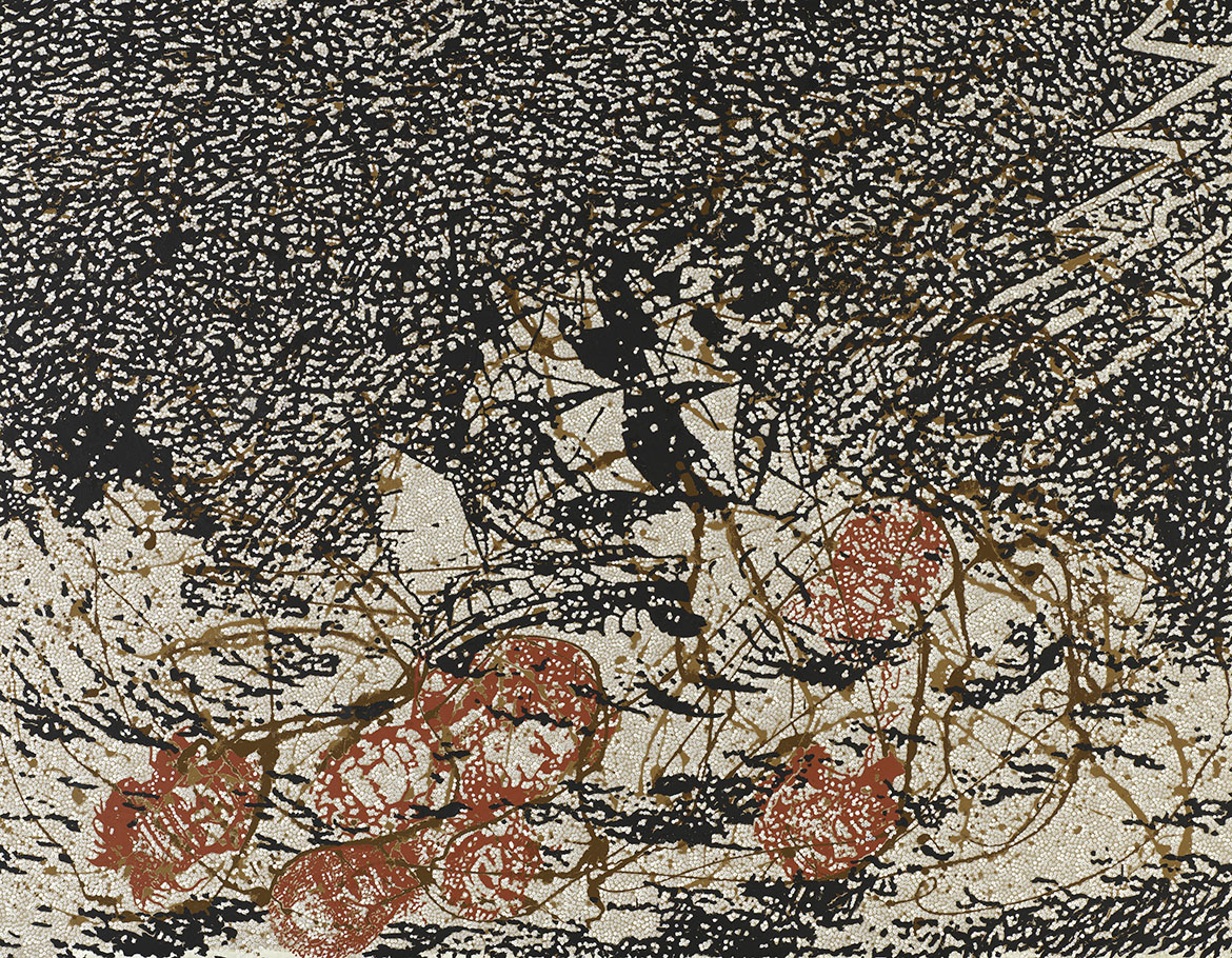
Gordon Bennett (1955–2014) created the triptych Bloodlines 1993 early in his career. It speaks of colonial violence and the consequences of being on the ‘wrong’ side of history, purchased in 2019, this powerful and sobering work is a major acquisition for the QAGOMA Collection.
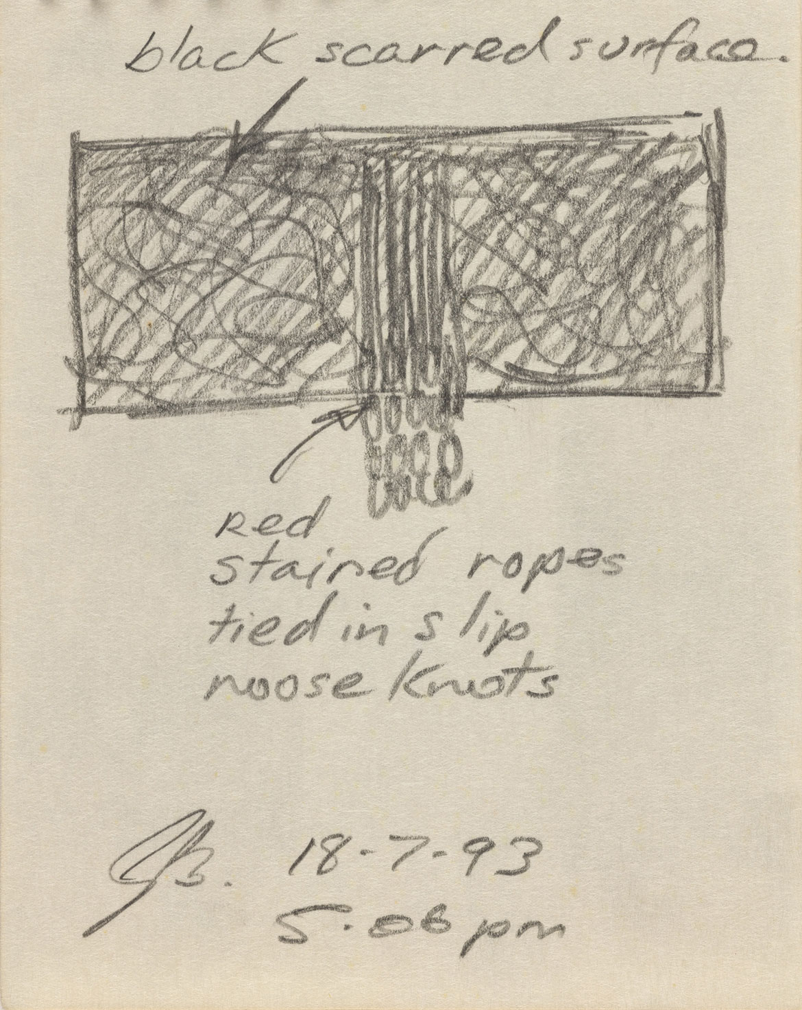
Gordon Bennett, Australia 1955-2014 / Notebook sketch, 18 July 1993, 5.06pm / Image courtesy: The Estate of Gordon Bennett
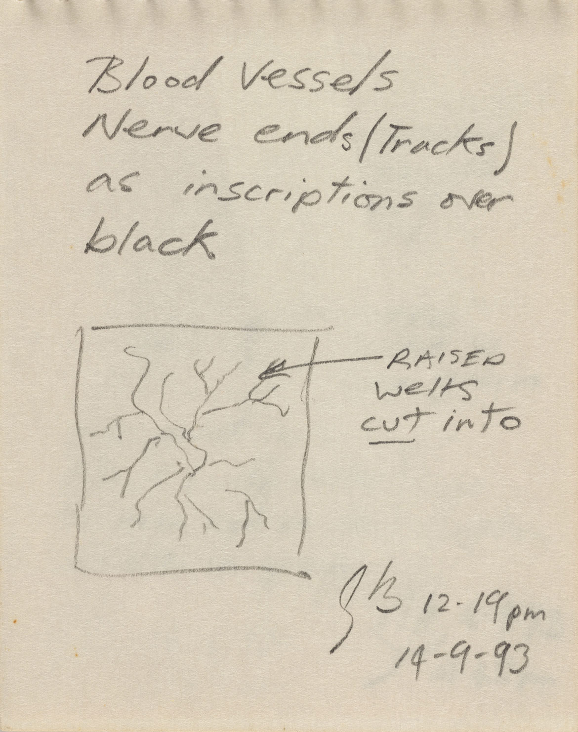
Gordon Bennett, Australia 1955-2014 / Notebook sketch, 14 September 1993, 12.19pm / Image courtesy: The Estate of Gordon Bennett
In his lifetime, Bennett was widely regarded as one of Queensland’s, and indeed one of Australia’s, most perceptive and inventive contemporary artists. After exhibitions at Brisbane’s Bellas Gallery and Sydney’s Museum of Contemporary Art in the late 1980s, Bennett was promptly included in major national events such as ‘Perspecta’ at the Art Gallery of New South Wales in 1989, the Art Gallery of South Australia’s Moët & Chandon Touring Exhibition, the ‘Adelaide Biennial of Australian Art’ in 1990, and the landmark ‘Balance 1990: Views, Visions, Influences’ at the Queensland Art Gallery (QAG). Given the difficult nature of his primary subject matter — the overlooked and unresolved crimes of Australia’s colonial period, and the persistent racism that has followed into the present — Bennett’s early and sustained success is testament to the intellectual and aesthetic relevance of his practice and the authenticity of his expression.
Gordon Bennett painting Possession Island 1991 in his Hautvillers studio, France / Photograph: Leanne Bennett / Image courtesy: The Estate of Gordon Bennett
Gordon Bennett was awarded the Moët & Chandon Australian Art Fellowship in 1991, standing in front of Possession Island 1991 / Image courtesy: The Estate of Gordon Bennett
Bloodlines is an early triptych that relates to Bennett’s ‘welt’ series of paintings, which is somewhat underrepresented in critical discussions of his practice. Bennett embarked on this body of work in France in December 1991 during the 12-month travel scholarship he was awarded through the Moët & Chandon Australian Art Fellowship he won that same year.1 At this time, Bennett frequently referenced the ‘drip technique’ of American abstract expressionist Jackson Pollock, sometimes using it to invoke a tangled web of history. More than a compositional device and clever art reference, he used the visual matrix of these netted drips to represent the narrative of destiny and sense of entitlement that cast Western colonial expansion across the globe. This same narrative also served to frame the First Nations people they encountered as primitive, in a state of nature which, by extension, served to rationalise that their lands were empty and therefore ripe for ‘civilisation’.2
The key QAGOMA Collection work Untitled 1991 is an excellent example of Bennett’s appropriation of Pollock. Brown lashes of paint are surrounded by a field of black and white dots that depict a colonial sailing ship braving a storm. In the lower half of this field, seven decapitated Aboriginal heads in red strike a pattern reminiscent of the composition used in The Raft of the Medusa 1818–19 by French Romantic painter Théodore Géricault. Géricault’s original memorialises, if not sensationalises, a tragic group of withered survivors from the shipwreck of the French naval frigate Méduse. Crucially, however, while Géricault’s original subjects float on rough seas, Bennett’s seem bound to the turbulent field itself, unable to resist the waves of Western culture that engulf them.
Bennett’s scenario incorporates his view that Pollock was an inheritor and beneficiary of the colonial mindset, primarily for his heavy debt to the otherwise marginalised Navaho sandpainting tradition. Though he was most likely sincere in his intentions, neither Pollock nor his promoters questioned the binary perspective of the civilised white innovator channelling the raw and primitive forms of an unsophisticated other.3
Exploring Pollock from another angle, in the ‘welt’ works, Bennett buried his drips under a uniform dark monochrome paint-skin. As he explains in reference to the first such example,
. . . this created a surface which looked remarkably like an illustration of the scarified back of an African slave I later saw reproduced in a book about the representation of Blacks in the nineteenth century; the title of the triptych was A Typical Negro, 1863.4
A typical negro [Gordon], published in Harper’s Weekly, 4 July 1863 / Image courtesy: Library of CongressThis famous image of a ‘scourged back’ was circulated as a photographic carte de visite, and further popularised as an engraving in Harper’s Weekly.5 The subject of the work, who was known as Gordon or ‘Whipped Peter’ (suggesting his name might have been Peter Gordon), was an escaped African-American man who had been enslaved on a Louisiana plantation run by a brutal overseer. The image is historically significant not only for the horror it documents, but also for its influence on public opinion toward slavery. The high circulation of Harper’s Weekly meant that the image had significant enough exposure to become a rallying point for the northern United States to intervene in the South. Bennett remarked:
With the ‘welt’ pieces I wanted to convey the wounding of the human spirit, its scarification; the overpainted Modernist trace of a Pollock skein as metaphor for the scar as trace, and memory, of a colonial lash . . . It may be argued that in taking this position I am portraying black people as victims. This was indeed my intention and I wanted not only to ‘play the victim’ but to take it further and use that energy to advantage by not resisting, or trying to display strength, but to show pain and how much it hurts, even to the extent of self-mutilation.6
While the monochrome overpainting in Bloodlines clearly references the skin of People of Colour and the history of violence directed toward them in the patterns of scarring, there is also an art historical precedent in the Russian avant-garde artist Kazimir Malevich and his black square paintings. Malevich’s gesture was a long-running preoccupation for Bennett, as he explains:
Malevich was most certainly trying to get beyond the medieval, denominational, religious confines of such [Russian] icons to a kind of
spiritual ‘essence’ that was common to all humanity. I certainly have no quarrel with that, and I admire Malevich very much, but it is clear that in reality black and indigenous peoples, as people considered ahistorical — trampled, enslaved, exploited and discarded, their lands confiscated and wealth plundered over five hundred years of colonialism — were not to be joining Europeans on their great journey to that glorious sunset and spiritual culmination waiting for humanity just over the horizon line.7
Bennett’s monochrome fields weren’t simply painted over; they were also cut, revealing a blood-red wound. This visual allusion to the body locates the violence inflicted in the present as much as the past. It heightens the consideration of inheritable aspects of such vicious, sustained violence as widespread trauma. While the scale of Bloodlines and its cuts is engulfing, the near symmetry of their patterns recalls the lines found in the palm of the hand. In fact, close associates of the artist have confirmed that these markings are based on Bennett’s own palms. This, too, suggests violence as something carried and inherited, and perhaps the desperate and dramatic expression of staring at one’s empty hands. On this, Bennett stated: ‘In this [gesture] I am drawing on Aboriginal funeral ceremonies in which ritualised public displays of grief and mourning can involve bloodletting and cutting one’s own body’ — though, notably, he also cited the precedent of Argentine–Italian painter Lucio Fontana and his cut canvases.8
The narrow centre panel of Bloodlines, composed of a cluster of red oxide-stained and purposefully knotted ropes, conjures the visceral image of looping veins. A more literal interpretation, however, would be a field of hanging nooses. Vigilante justice in the form of lynching was not uncommon in the southern United States. In Australia, however, massacres or ‘dispersals’ were generally carried out with gunfire.9 This ambiguity might suggest that Bennett was making a more contemporary and local reference to Aboriginal deaths in custody. Hanging deaths of Aboriginal people in custody were shockingly common in Australia during the 1980s, and were a key statistic in the call for a Royal Commission into Aboriginal Deaths in Custody report commissioned by the Hawke Government in 1987.
It is conceivable that the use of symmetry was also intended to recall a flayed figure, and perhaps the Crucifixion. Although oblique, the notion is reinforced by the use of the triptych format, which arose from early Christian art and the tradition of three-panel folding altar paintings. Similarly, the title ‘Bloodlines’ might evoke the history of the Stolen Generations, and specifically the impact of eugenics and assimilationist policies. These were often supported and administered by the church, which allowed for the destruction of families and the erosion of tradition by asserting that Aboriginal parents had no right to their children, who could be taken by the government without cause. Furthermore, the memory of pernicious public discussions of the implications of mixed blood, and alienating follow-on questions of who can reasonably claim an authentic Aboriginal heritage — or, inversely who might be able or allowed to pass for being white on a measure of appearance or ancestral percentages — would also appear to provide relevant historical context to Bennett’s powerful gesture.
Constructed by drawing on a wide variety of potent historical sources, Gordon Bennett’s extraordinarily searching and intellectually supple work Bloodlines seeks to better acknowledge the largely ‘hidden’ or ignored history of colonial violence in Australia, and its continuing burden on the present. Crucially, Bennett has taken great pains to include the frame of the binary mainstream narratives of black/white, primitive/civilised in his picture, and to include the consequences of this thinking on those people who are rendered less than. Sombre and even grotesque, Bloodlines attempts to shock a broad audience into an empathetic state, and jolt them into understanding the notion of ‘peaceful settlement’ as a myth.10
‘Unfinished Business: The Art of Gordon Bennett’ was in the Marica Sourris and James C. Sourris AM Galleries (3.3 and 3.4), Gallery of Modern Art from 7 November 2020 until 21 March 2021.
Peter McKay is Curatorial Manager, Australian Art, QAGOMA
Endnotes 1 Gordon Bennett, ‘The manifest toe’, in Ian McLean and Gordon Bennett, The Art of Gordon Bennett, Craftsman House, Sydney, 1996, p.48. 2, 3 Bennett, pp.44–7. 4 Bennett, pp.48. 5 ‘A typical negro’, Harper’s Weekly, 4 July 1863, p.429. 6, 7, 8 Bennett, p.50. 9 Lorena Allam and Nick Evershed, ‘The killing times: The massacres of Aboriginal people Australia must confront’, Guardian, 4 March 2019, https://www.theguardian.com/
australia-news/2019/mar/04/the-killing-times-themassacres-
of-aboriginal-people-australia-must-confront,
viewed 22 July 2019. 10 Bennett, p.53.
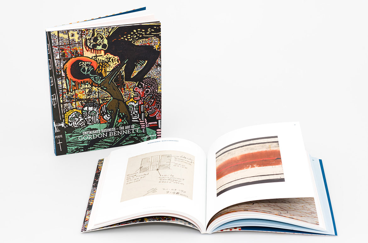
The publication
At 200 pages and with more than 120 colour illustrations, Unfinished Business: The Art of Gordon Bennett includes works created from the 1980s to 2014 sourced from studio, public and private collections, including early installation works; Bennett’s ‘history’ paintings; mirror paintings, De Stijl works; his ‘Home décor’ series; ‘Notes to Basquiat’ works; abstract ‘Stripe’ paintings; and late works showing renewed engagement with political contexts. Pages from the artist’s personal notebooks, as well as archival photographs provided by the Gordon Bennett Estate, provide intimate insight into how the artist worked. The publication has been sponsored by the Gordon Darling Foundation.
Know Brisbane through the Collection / Read more about Australian Art / Subscribe to QAGOMA YouTube to go behind-the-scenes
Acknowledgment of Country The Queensland Art Gallery | Gallery of Modern Art (QAGOMA) acknowledges the traditional custodians of the land upon which the Gallery stands in Brisbane. We pay respect to Aboriginal and Torres Strait Islander elders past and present and, in the spirit of reconciliation, acknowledge the immense creative contribution Indigenous people make to the art and culture of this country.
It is customary in many Indigenous communities not to mention the name or reproduce photographs of the deceased. All such mentions and photographs are with permission, however, care and discretion should be exercised.
Featured image detail: Gordon Bennett Bloodlines 1993
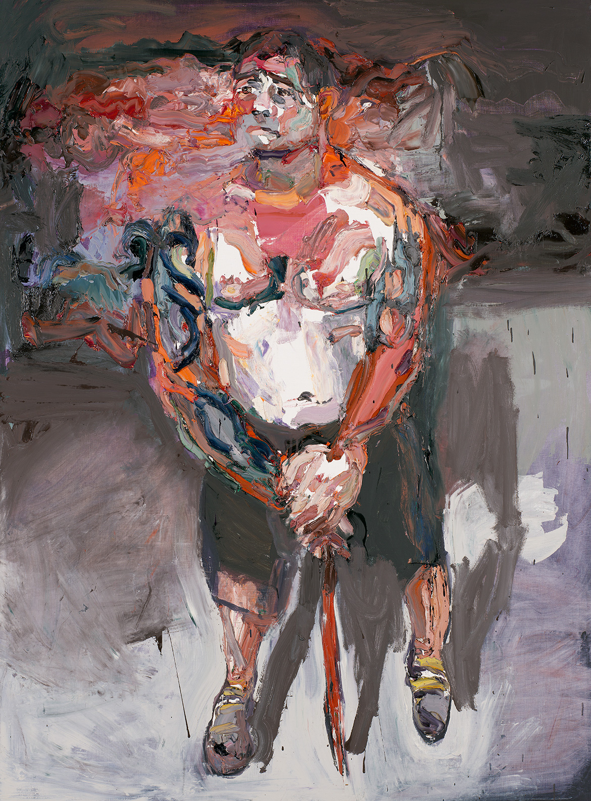
In October 2011, Ben Quilty toured with Australian troops as an official war artist for the Australian War Memorial, part of its scheme to document the experiences of Australians deployed to the frontline in Afghanistan. Quilty’s Sergeant P, after Afghanistan 2012 is a brave attempt to capture the intensity of experience felt by soldiers involved in military conflict, and is one of the most remarkable works to have come out of Quilty’s encounter with Australian military personnel in Afghanistan.
By his own admission, Quilty has from a young age feared the idea of being a participant in war, and was accordingly a committed pacifist. His time in Afghanistan, however, and more specifically his contact with personnel in the context of their duties, has greatly affected his attitude towards the combatants.
The first night we landed [in Afghanistan] two or three rockets landed within the compound of Kandahar. They said to me ‘if it’s a direct hit, it’s coming straight through’. We flew into Tarin Kowt . . . Before I went to Afghanistan, I guess I was anti-war. Most of the soldiers I met are. But the truth is far more complicated and the slogan is a simple one and I feel it does a huge disservice to the young people who are in Afghanistan.1
War reportage is often limited to particulars about campaigns: time, location, protagonists, their methods and casualties. In this way, the impact of military conflict on individuals and communities is often underrepresented — but the experience of such events is a world away from such record-keeping. Sergeant P, after Afghanistan 2012 is a raw image of a burden that is often hidden from view. In painting the psyche of a soldier returned from contemporary service, Quilty offers a strikingly empathetic portrayal of Australians involved in military conflict.
RELATED WORKS IN THE COLLECTION: ANZAC stands for Australian and New Zealand Army Corps, the soldiers in those forces became known as ANZACs. Anzac Day is a commemoration of the anniversary of the landing of those troops at Gallipoli, Turkey on 25 April in 1915 / 11 November is Remembrance Day, the memorial day observed at the 11th hour of the 11th day of the 11th month since the end of the First World War in 1918 to honour those who have died in the line of duty.
This significant work is an insight into the character and dimension of Australian society and some of its most heroic participants. As Quilty explained, ‘Sergeant P serving in the SAS is a ‘protected identity’, injured in the line of duty, he was flown to Germany and put in an induced coma for six weeks, and stayed in the country for three months before being brought home for further medical support in Australia. Despite his severe injuries, he was determined to stand throughout the painting process.2
Sergeant P, after Afghanistan captures the visceral intensity of the sitter’s raw physicality and resilient psyche. The strained expression and posture of the subject, emphasised by an unusual foreshortening, convey Quilty’s empathetic understanding of the sitter’s mental, physical and emotional burden. In the background, his trademark thick bands of impasto colour are ruptured and tangled together, describing the shadows that the experience continues to cast on the sergeant’s personality and psychological wellbeing.
The ongoing effects of stress, fear, exhaustion and violence — and the spectrum of complications that these experiences provoke — can plague combat survivors and their loved ones all their lives. Ben Quilty’s effort to shed light on these experiences enables the Gallery to convey a powerful and underplayed contemporary war narrative, and make a present-day interjection into a subject that is too frequently referred to in the context of the past.
Peter McKay is Curatorial Manager, Australian Art, QAGOMA
Endnotes 1 Ben Quilty, ‘War Paint’, Australian Story, Australian Broadcasting Corporation, first broadcast 3 September 2012. 2 Personal communication with the artist, 4 April 2014.
Delve deeper into the collection
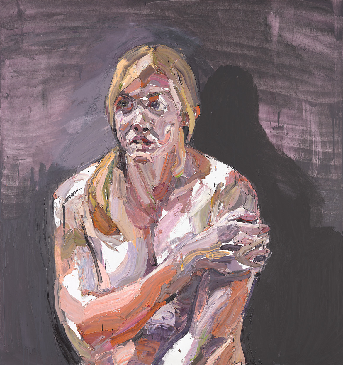
Captain Kate Porter, after Afghanistan 2012 is a caring portrayal of this sitter’s time spent in Afghanistan’s war zone, and a strong acknowledgement of the lasting emotional and psychological impacts of such exposure. As part of the larger ‘After Afghanistan’ series, this work is also emblematic of the wider experience endured by many Australians at war and performing peacekeeping missions.
We acknowledge the Traditional Owners of the land on which the Queensland Art Gallery | Gallery of Modern Art stands and recognise the creative contribution First Australians make to the art and culture of this country.


 1996")


 / Purchased 2019 with funds from the Neilson Foundation through the Queensland Art Gallery | Gallery of Modern Art Foundation / Collection: Queensland Art Gallery | Gallery of Modern Art / © Estate of Gordon Bennett")


 / Purchased with funds from the Foundation for the Historic Houses Trust, Museum of Sydney Appeal, 2007 / Collection: Museum of Sydney, Sydney Living Museums / © The Estate of Gordon Bennett")