Making reference to the Rolling Stones classic ‘You can’t always get what you want’, from the 1969 album Let It Bleed, the Get What You Want film program (2 September until 2 October 2016) flashes forwards through five decades of music, surveying the lives and experiences of its composers, performers and fans.
Get What You Want was a selection of documentary and fiction films concerned with different genres of music, from country, disco, folk and hip hop to house, punk, metal, reggae and soul. It offers viewers a unique platform from which to appraise the creative and social dynamics operating across these different musical subcultures, as well as acknowledging the exchange and movement between them. These films underline the idea that music, in all its endless permutations, can enrich our identities and transform both musician and listener into the somebody they want to be.
DELVE DEEPER: Dip into more music blogs
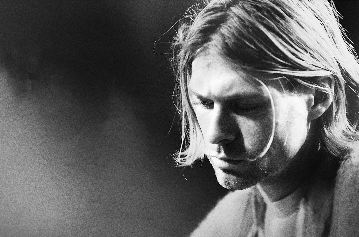
Contemplating what motivates musicians, films such as Don Cheadle’s take on jazz legend Miles Davis (Miles Ahead 2015) are accompanied by Nick Cave’s esoteric 20,000 Days on Earth 2014 and the celebrated posthumous study on Amy Winehouse (Amy 2015). The Carter 2009 offers eye-popping insights into Lil’ Wayne’s success, while Cobain: Montage of Heck 2015 and Anvil: The Story of Anvil 2008 offer divergent tales of struggle and resolve.
The program also explores how the music industry brings audience and performer together, with films such as the disturbing K-Pop documentary 9 Muses of Star Empire 2012, the archetypal rock rivalry of 2004’s Dig!, the restless innovation seen in Our Vinyl Weighs a Ton: This is Stones Throw Records 2013, and the heart-rending story of Charles Bradley (Charles Bradley: Soul of America 2012), who released his powerful first album at the age of 62. The inimitable Coen brothers also take a look at the life of a musician rejected by the industry, family and friends in their 2013 Cannes Grand Prix winner, Inside Llewyn Davis.
Music’s capacity to promote hope and foster change on both an individual and a community level features heavily in 2012’s Marley (the illuminating documentary on Bob Marley), in the Portuguese-language film Death Metal Angola (an account of the burgeoning metal scene in war-torn Angola) 2012, and in Shake the Dust 2014 (through interviews and performances by breakdancers in Cambodia, Colombia, Uganda and Yemen). Dixie Chicks: Shut Up and Sing 2006, about the boycotts organised against the country group during George W Bush’s Iraq War; and The Punk Singer, a take on the art and life of activist Kathleen Hanna, both recall the obstacles faced by public figures advocating progressive politics. Maestro, a social history of the dance music underground in 1970s New York made in 2003; and the recent reflections from Madonna’s backup dancers on her 1990 Blond Ambition World Tour in Strike a Pose 2016, both promote the idea of growth through better living (and dancing).
If you want to revel in accounts of performers striving for great musical experiences, check out the 2006 backstage Wu-Tang drama Rock the Bells, Q Bert’s mind-expanding animated quest Wave Twisters 2001, the Beastie Boy’s innovative concert film Awesome; ‘I … Shot That!’ 2006, the 2013 underground take on LA’s Low End Theory scene titled All Ears: A Glimpse into the Los Angeles Beat Community, and Penelope Spheeris’s beautiful madness in The Decline of Western Civilisation parts I and II (1981/88).
For those loyal to the pop royalty of earlier times, In Bed with Madonna 1991 and Prince’s Purple Rain 1984 will also be screening. So whether you carefully program your playlists to mirror your personality, or can groove to any random radio station, ‘Get What You Want’ should shuffle your sensibilities.
Dip into our Cinema blogs / View the ongoing Australian Cinémathèque program
QAGOMA is the only Australian art gallery with purpose-built facilities dedicated to film and the moving image. The Australian Cinémathèque at the Gallery of Modern Art (GOMA) provides an ongoing program of film and video that you’re unlikely to see elsewhere, offering a rich and diverse experience of the moving image, showcasing the work of influential filmmakers and international cinema, rare 35mm prints, recent restorations and silent films with live musical accompaniment on the Gallery’s Wurlitzer organ originally installed in Brisbane’s Regent Theatre in November 1929.
Featured image detail: Production still from 20,000 Days on Earth 2014 / Directors: Iain Forsyth, Jane Pollard / Image courtesy: Madman Entertainment
#QAGOMA