Full Face: Artists’ Helmets


Full Face: Artists’ Helmets’ was developed in response to ‘The Motorcycle: Design, Art, Desire’ exhibition showcasing 100 motorcycles from the 1870s to the present celebrating 150 years of motorcycle history.

Accepting our invitation to individualise a Biltwell Gringo ECE ‘full face’ helmet, 15 contemporary Australian artists — Monika Behrens, Kate Beynon, David Booth (ghostpatrol), Eric Bridgeman and Alison Wel, eX de Medici, Shaun Gladwell, Madeleine Kelly, Callum McGrath, Archie Moore, Robert Moore, Nell, Reko Rennie, Brian Robinson, TextaQueen, and Guan Wei — have been inspired by the helmets’ sculptural form.

Shaun Gladwell / Vase 2020 / Courtesy: The art ist
‘Full face’ helmet by Monika Behren

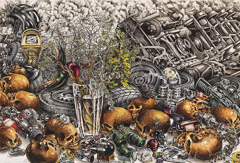
Shaun Gladwell has a longstanding fascination with motorcycles, through both personal interest and an appreciation of the vehicle’s role in popular culture. His video work Approach to Mundi Mundi 2007 — which was filmed on the outskirts of the town featured in Mad Max (1979) — appears in ‘The Motorcycle’. Gladwell’s contribution to ‘Full Face’ is an inverted helmet filled with plastic flowers resembling the garlands that appear at roadside memorials, reminding us that motorcycling has its risks.

Monika Behrens similarly acknowledges the darker side of riding. She has painted 13 hallucinogenic flowers on her helmet, alluding to the number’s associations with underground biker communities and illicit drugs. The plants pose a subtle challenge to this culture, subverting, in her words, ‘the concept of the rough/tough biker by appearing soft and decorative’.

DELVE DEEPER: Browse the FULL LIST OF MOTORCYCLES from humble origins to cutting-edge prototypes

RELATED: READ MORE ABOUT THE BIKES ON DISPLAY

Guan Wei, Ritualistic helmet 2020 / Robert Moore, Kindness 2020 / Madeleine Kelly, Birds of passage 2020 / Monika Behrens, 13 2020 / Courtesy: The artists

Some artists have transposed imagery that they use in their practice to the form of the helmet, exploiting its convex shape. For example, Guan Wei, an artist known for his idiosyncratic approach, has juxtaposed motifs associated with China’s Cultural Revolution against images of rebellion from popular culture.

Torres Strait Islander artist Brian Robinson has likewise employed an array of personally significant symbols, including the Dhari, or headdress, that appears on the Torres Strait Islander flag, and the star constellation of Tagai that signifies the value of astronomy to his seafaring people.

The exhibition reflects a range of other approaches, some of them deeply personal. Archie Moore, whose late uncle Garry was ‘well-known for riding his bikes vast distances between towns west of Toowoomba’ and ‘would custom-make his own bikes from scrap pieces’, has created an homage. Moore’s helmet features a spectacular set of cow horns reminiscent of the ones his uncle once used to individualise his own helmets, worn by the artist as a child.

Guan Wei / Ritualistic helmet 2020 / Courtesy: The artist
Archie Moore / Uncle Garry (Helmet) 2020 / Courtesy: The artist
Eric Bridgeman and Alison Wel / Giblin (Head) 2020 / Courtesy: The artists
eX de Medici / Bucket for a blood supply 2020 / Courtesy: The artist

Eric Bridgeman has made his helmet with his cousin Alison Wel, continuing his collaboration with family and friends from his maternal tribe, the Yuri Alaiku, from Papua New Guinea’s Simbu Province. Drawing on their shared heritage, the artists have embellished their artwork with a bilum headpiece, woven by Wel, and clan designs that evoke the ‘growth of hair patterns on the human skull’.

Several artists have engaged with ethical issues. eX de Medici has painted a brain on her helmet, alluding to its function in theatres of war. Having served as an official war artist, she is well-versed in the role that the headgear serves. The helmet is sometimes referred to as a ‘brain bucket’ because it shields the brain and, in catastrophic circumstances, contains its remains.

Together, these varied and inventive responses provide a striking and thought-provoking counterpoint to the design focus of ‘The Motorcycle: Design, Art, Desire’.

Samantha Littley is Curator, Australian Art, QAGOMA

Robert Moore / Kindness 2020 / Courtesy: The artist

Read more about Motorcycles / Know Brisbane through the Collection / Dive into Australian Art / Subscribe to QAGOMA YouTube to go behind-the-scenes

Featured image: Monika Behrens 13 2020

Show off your ride with #MotorcycleGOMA #QAGOMA 4-2020

Finding joy in small things


Grace Cossington Smith’s artworks are a reminder that joy is all around us. In her hands, an array of objects, the fold of a tablecloth or light falling through stained glass inspire delight and open windows onto her world.

We look to the paintings of Cossington Smith who found pleasure in the things about her. While she spent much of her life in and around her family home ‘Cossington’ in Turramurra, she produced a body of work – including still lifes, interiors and paintings of her hometown, Sydney – that has distinguished her as one Australia’s most important modernists.

 Grace Cossington Smith ‘Interior’ 1958

Grace Cossington Smith, Australia 1892-1984 / Interior 1958 / Oil on composition board / 91.4 x 58.1cm / Gift of the Godfrey Rivers Trust through Miss Daphne Mayo 1958 / Collection: Queensland Art Gallery | Gallery of Modern Art / © QAGOMA

Cossington Smith’s precocious artistic talent was recognised and nurtured by her family, who she sketched prodigiously and who feature in some of her most iconic paintings. The sock knitter 1915 depicts her sister Madge engaged in a pursuit that occupied many women on the homefront during the First World War. Knitting socks for the troops was a way to contribute to the war effort, and a welcome distraction from daily concerns. More than a portrait of domesticity, the painting, with its striking diagonals and unusual combination of pattern and colour, has been described by curator Daniel Thomas as ‘the first fully Post-Impressionist work to be exhibited in Australia’.1

Cossington Smith made the painting while a student of the influential Italian-born artist Antonio Dattilo Rubbo who was alive to artistic developments in Europe, and encouraged his pupils to experiment. Under Rubbo’s influence, Cossington Smith embraced Paul Cezanne’s shifting tones and forms, and Vincent Van Gogh’s colour-drenched canvases. Their work was to make a lasting impression, as she recalled in an interview with Hazel de Berg in 1965:

‘My chief interest, I think, has always been colour, but not flat crude colour, it must be colour within colour, it has to shine.’2

Grace Cossington Smith ‘Before the arches met’ c.1930

Grace Cossington Smith, Australia 1892-1984 / Before the arches met c.1930 / Crayon and coloured pencils over pencil on cream wove paper / 37.8 x 43.4cm / Purchased 1976. Godfrey Rivers Trust / Collection: Queensland Art Gallery | Gallery of Modern Art / © QAGOMA

Paintings such as Things on an iron tray on the floor c.1928 epitomise this mantra. The artwork was shown in Cossington Smith’s first solo exhibition at the Grosvenor Galleries, Sydney, in 1928, and around the time that she began a series of artworks depicting the Sydney Harbour Bridge under construction. A feat of contemporary engineering and design, the Bridge became a potent symbol of modern Australia, as artists were quick to recognise. Cossington Smith captured its dynamism in drawings such as Before the arches met c.1930, using radiating bands of colour and the tantalising gap between the spans to generate visual tension.

Grace Cossington Smith ‘Church interior’ c.1941-42 

Grace Cossington Smith, Australia 1892-1984 / Church interior c.1941-42 (inscr. 1937) / Oil with pencil on pulpboard / 55.2 x 42.2cm / Purchased 2001 with funds raised through The Grace Cossington Smith Queensland Art Gallery Foundation Appeal / Collection: Queensland Art Gallery | Gallery of Modern Art / © Estate of Grace Cossington Smith

A similar treatment of colour and form distinguishes Church interior c.1941–42 (inscr. 1937). The painting incorporates Cossington Smith’s major stylistic interests and is meaningful in terms of her personal history, portraying the Smith family’s place of worship, the new St James’ Anglican Church in Turramurra, built in 1941. The artist’s vibrant hues and varied brushstrokes convey her delight in the rhythms of the man-made structure, and the spiritual quality that she observed in the world around her. As she wrote:

All form – landscape, interiors, still life, flowers, animal, people – have (sic) an inarticulate grace and beauty; painting to me is expressing this form in colour, colour vibrant with light – but containing this other, silent quality which is unconscious, and belongs to all things created.3

Grace Cossington Smith ‘Interior in Florence’ 1949 

Grace Cossington Smith, Australia 1892-1984 / Interior in Florence 1949 / Oil on board / 35 x 25.2cm (sight) / Gift in memory of Richard Harnett Cambridge and Merle Cambridge through the Queensland Art Gallery Foundation 2010 / Collection: Queensland Art Gallery | Gallery of Modern Art / © Estate of Grace Cossington Smith

Interiors were a favourite subject for Cossington Smith, filling the pages of her sketchbooks and becoming the subject of some of her best known works. Interior in Florence 1949, made after her second trip to Europe, is an example of the distinctive approach that she brought to the genre. While the painting’s muted colours reflect the soft light of the northern hemisphere, the composition itself is characteristic. Utilising the frame itself and placing an emphasis on the doorway, curtains and windows within the room, Cossington Smith expands the space within her painting and brings the scene outside in. A comparable effect can be seen in one of the artist’s later paintings, Interior 1958, in which the window pane on the far right suggests a world beyond the picture’s frame.

Whether painting an assortment of well-loved kitchen implements, the interior of her family home or, as she described it, ‘my dear old bridge’, Grace Cossington Smith’s ability to perceive and express joy in her immediate surroundings is a model worth emulating.4

Samantha Littley is Curator, Australian Art, QAGOMA

Endnotes
1 Daniel Thomas, Grace Cossington Smith, Art Gallery of New South Wales, Sydney, 1973, p.69.
2 Grace, Cossington Smith, interview with Hazel de Berg, oral history tapes, National Library of Australia, 16 August 1965.
3 Grace,Cossington Smith, quoted in Mervyn Horton, Present Day Art in Australia‘, Ure Smith, Sydney, 1969, p.203.
4 Grace Cossington Smith, quoted in Deborah Hart, ‘The curve of the Bridge’, in Grace Cossington Smith: A retrospective exhibition, National Gallery of Australia, https://nga.gov.au/exhibition/cossingtonsmith/default.cfm?MnuID=4&Essay=2, accessed 15 May 2020.

#QAGOMA

Thea Proctor’s woodcut reminds us of life’s simple pleasures


Thea Proctor’s vibrant hand-coloured woodcut Summer, inspired by the tradition of Japanese ukiyo-e prints, brings me joy because it reminds me of life’s simple pleasures (ikigai). 

In 1921, having spent much of the past two decades in London, Thea Proctor returned to Australia and settled in Sydney where she became an influential artist and a doyenne of style. Biographer Jan Minchin has noted that Proctor was ‘Frequently described as looking like one of her own pictures … [and] considered the most picturesque hostess in Sydney.’1 Even before Proctor’s arrival, the publisher Sydney Ure Smith had commissioned her to produce covers for his new magazine The Home. Her sophisticated designs and articles on art, fashion and interior decorating would make the publication essential reading.

RELATED: Portrait group (The mother) 1907 is one of a series of works that feature George Lambert’s friend and colleague Thea Proctor.

Margaret Preston ‘Black swans, Wallis Lake, NSW’

Margaret Preston, Australia 1875-1963 / Black swans, Wallis Lake, NSW 1923 / Woodcut on thin Japanese paper / 19.2 x 27.5cm (comp.) / Purchased 2003. Queensland Art Gallery Foundation Grant / Collection: Queensland Art Gallery | Gallery of Modern Art / © Margaret Preston/Copyright Agency

Proctor was a passionate advocate for modern art, a tireless campaigner for women artists, and a devotee of fellow Sydneysider and leading contemporary artist Margaret Preston. In the early 1920s, Preston had begun to make woodcuts inspired by Japanese ukiyo-e prints, an art form that flourished in Edo period Japan (1600–1868) and featured ephemeral scenes from everyday life, or ‘pictures of the floating world’.2 Preston saw in these works the simplification of colour and form to which many modern artists aspired, and encouraged Proctor and others to explore the technique.

Summer 1930 is one of only 13 woodcuts Proctor is known to have made, and displays the bold lines and vibrant colours characteristic of her work in the medium.3 Her love of design is well illustrated here – elements like the Dalmatian, the patterned pillow and the scalloping on the dress of the girl in the hammock have been included for their dazzling effect.

Thea Proctor ‘Summer’

Thea Proctor, Australia 1879-1966 / Summer 1930 / Woodcut, hand-coloured on Oriental paper / 17.3 x 22.8cm (comp.) / Purchased 2002. Queensland Art Gallery Foundation Grant / Collection: Queensland Art Gallery | Gallery of Modern Art / © Estate of Thea Proctor

Although the print’s decorative qualities are one of its most appealing features, the work is more than simply an eye-catching arrangement. It provides an insight into the period in which Proctor lived, and the urbane circles in which she moved. Her dual interests in art and couture are conveyed through the figure of the girl browsing through the magazines of modern art and her chic companion, parasol in hand. It is through the considered placement of these accoutrements that Proctor is able to communicate, with great economy of style, those things she valued most.

As her relative Thea Waddell later recollected about another work by Proctor in the Gallery’s Collection, Still life and interior, ‘All her pre-occupations are there – the fans … which she loved, umbrellas or parasols used most elegantly to keep off the sun … books on art to be shared and read.’4

Thea Proctor ‘The swing’

Thea Proctor, Australia 1879-1966 / The swing 1925, printed 1926 / Woodcut, hand-coloured on laid Oriental paper / 25.1 x 24.9cm (block) / Purchased 1980 / Collection: Queensland Art Gallery | Gallery of Modern Art / © Art Gallery of New South Wales

Summer relates to two other woodcuts by Proctor held by the Gallery, including The swing 1925 and Women with fans 1930. In each instance, the artist has constructed a tableau in which her characters act out their roles as members of the leisured classes, and form picturesque elements in a carefully orchestrated composition.

Thea Proctor ‘Women with fans’

Thea Proctor, Australia 1879-1966 / Women with fans 1930 / Woodcut on Oriental paper / 22 x 22.2cm (comp.) / Purchased 2002. Queensland Art Gallery Foundation Grant / Collection: Queensland Art Gallery | Gallery of Modern Art / © Estate of Thea Proctor

In Women with fans, the posed stillness of the figures is juxtaposed against the busy harbour behind them, creating a visual tension that is typical of Proctor’s prints. The interior depicted is likely to be her home in Double Bay, while the models are her friends and fellow printmakers, Ethel Spowers and Eveline Syme.5 Their stylish attire and hairstyles reflect the fashions of the day, and are indicative of Proctor’s interest in costume. The striking floral dress worn by Spowers references the outfits designed for the dancers of the Ballet Russes, who Proctor had seen perform in 1911, and of which she said ‘it would be difficult to imagine anything more beautiful and inspiring’.6

Each of these scenes appear as moments frozen in time, yet they retain a strong sense of dynamism. In Summer Proctor has achieved this effect by contrasting the languid poses of the young women with the bright hues and rhythmic lines that surround them. The raised leg of the girl reading serves as a striking counterpoint to those of her companion, which dangle from the hammock in which she lies, their opposing figures forming a whorl of colour that arrests the eye.

Samantha Littley is Curator, Australian Art, QAGOMA

Endnotes
1 Roger Butler and Jan Minchin, Thea Proctor: The prints, Resolution Press, Sydney, 1980, p.6.
2 Preston based her woodcut Black swans, Wallis Lake, NSW 1923 on an illustration of a carved wood panel of wild geese by Hon’ami Kōetsu (1558–1637), which she had seen in Marcus B. Huish’s Japan and its art (first published in 1889).

3 Chris Deutsher and Roger Butler, A Survey of Australian Relief Prints 1900/1950, Deutsher Galleries, Armadale, 1978, p.28. Despite producing only a small number of woodcuts herself, Proctor introduced many others to the medium, including Ruth Ainsworth, Gladys Gibbons, Ysobel Irvine, Amie Kingston and Ailsa Lee Brown. See Joan Kerr, (ed.), Heritage: The national women’s art book, Craftsman House, Roseville East, 1995, p.433.
4 Thea Waddell in correspondence with Bettina MacAulay, 14 February 1982, QAGOMA Research Library Collection Artist File [unpublished].
5 Helen Topliss, Modernism and Feminism: Australian women artists 1900–1940, Craftsman House, Roseville East, 1996, p.159.
6 Thea Proctor, quoted in Kerr, (ed.), Heritage, p.433.

Featured image detail: Thea Proctor Summer 1930
#QAGOMA

Minute beauty celebrated


Over a career spanning almost forty years, eX de Medici has followed a range of artistic paths, while consistently critiquing the social and political systems that govern our lives. Having begun her career in the 1980s in painting, photomedia, performance and installation, de Medici worked for a decade as a tattooist after completing an apprenticeship in Los Angeles. She relinquished professional tattooing in 2000 to concentrate on watercolour, the medium for which she is best known.

De Medici’s dazzling, virtuosic watercolours foreground her central concerns, including the value and fragility of life, global affairs and the enmeshed and universal themes of power, conflict, and death. Her panoramic painting The wreckers 2019, for instance, decries global battles for political supremacy and their consequences. As the artist’s gallerist Joanna Strumpf has expressed, the work builds ‘on de Medici’s first depiction of a wreckage in Live the (Big Black) Dream 2006 (illustrated), which features a train crash and foreshadowed the Global Financial Crisis.’1

De Medici is also renowned for works of decorative art that are inspired by, and based on, her watercolours. Key examples include Shotgun Wedding Dress/ Cleave 2015 from the National Gallery of Australia, and The Seat of Love and Hate 2017–18, held by the Museum of Applied Arts and Sciences.

Through these varied themes and materials, De Medici aims to seduce her viewers and shake them out of complacency. Ultimately, her audiences are as captivated by her aesthetic and technical brilliance, as they are by her topical and thought-provoking subject matter. 

Endnote
1 Joanna Strumpf, ‘eX de Medici presents The Wreckers at Sullivan+Strumpf Sydney’, Art News Portal, 7 November 2019, https://www.artnewsportal.com/art-news/ex-de-medici-presents-the-wreckers-at-sullivan-strumpf-sydney.

eX de Medici ‘Live the (Big Black) Dream’

eX de Medici, Australia b.1959 / Live the (Big Black) Dream 2006 / Watercolour and metallic pigment on paper / 114.2 x 167.4cm (irreg.) / Purchased 2006. Queensland Art Gallery Foundation Grant / Collection: Queensland Art Gallery | Gallery of Modern Art / © eX de Medici

eX de Medici ‘The theory of everything’

eX de Medici, Australia b.1959 / The theory of everything 2005 / Watercolour and metallic pigment on Arches paper / 114.3 x 176.3cm / Purchased 2005 / Collection: Queensland Art Gallery | Gallery of Modern Art / © eX de Medici

#QAGOMA

Church interior: An uplifting vision of everyday life


Church interior c.1941-42 (illustrated) is one of Grace Cossington Smith’s most significant achievements, incorporating her major stylistic approaches and interests. It is also meaningful in terms of the artist’s personal history, as it depicts the Smith family’s place of worship, the new St James’ Anglican Church in Turramurra, Sydney, built in 1941.

The painting encapsulates the artist’s concern with colour, embodying the pure, singing quality so often found in her work and the spiritual quality she found in the world around her. She wrote:

All form – landscape, interiors, still life, flowers, animals, people – have [sic] an inarticulate grace and beauty; painting to me is expressing this form in colour, colour vibrant with light – but containing this other, silent quality which is unconscious, and belongs to all things created.1

Grace Cossington Smith ‘Church interior’ c.1941-42

Grace Cossington Smith, Australia 1892-1984 / Church interior c.1941-42 (inscr. 1937) / Oil with pencil on pulpboard / 55.2 x 42.2cm / Purchased 2001 with funds raised through The Grace Cossington Smith QAG Foundation Appeal / Collection: Queensland Art Gallery | Gallery of Modern Art / © Estate of Grace Cossington Smith

Each stroke of colour the artist has laid down contains a rainbow of hues, the bristles used to apply the paint scraping through the layers to reveal myriad tones below. The colours create unexpected juxtapositions: combinations like the cadmium yellow and viridian green used to delineate the altar startle and delight, and help to create the painting’s striking effect. Significantly the pencil, which Cossington Smith has used for underdrawing and to outline elements of her composition, provides the only black in the work. The artist has employed her knowledge of colour theory to bring elements of her composition towards the picture plane. There is thus both an illusion of depth and a flattening of space. Speaking of this tendency, the artist said: ‘I just see a plane, and another beside it; I don’t want the distance’.2

The vibrant hues of the painting work in unison with the varied brushstrokes, which range from small, ordered stipples, through to long, generously applied strokes, to give the work its vitality. The stained glass windows are realised in jewel-like dabs, which form an abstracted yet recognisable image of the ascension of Christ,3 while the interlocking squares of paint in the upper right corner present a completely abstract pattern.4 These transitions echo the shifts that occurred in the artist’s oeuvre from her earliest canvases through to her mature work.

The aisle, which the artist has delineated in strokes of vivid blue, leads the viewer into the composition towards the central point of focus: the altar. The eye is then drawn upwards by the lancet windows and the vaulted, wooden beams, and down again along the multicoloured lines of the church’s stone archway to the congregation below. This energy and the obvious delight the artist found in reproducing the shapes of the man-made structure, recalls Cossington Smith’s earlier works of the Sydney Harbour Bridge. Despite this predominance of movement and colour there are moments of stillness and poignancy within the painting – the intimate connection established between the small boy in his Sunday best who glances up at his smartly dressed mother, for instance. This image is at once humorous and touching, perhaps a contemporary representation of the archetypal image of the Mother and Child.

Grace Cossington Smith ‘Before the arches met’ c.1930

Grace Cossington Smith, Australia 1892-1984 / Before the arches met c.1930 / Crayon and coloured pencils over pencil on cream wove paper / 37.8 x 43.4cm / Purchased 1976. Godfrey Rivers Trust / Collection: Queensland Art Gallery | Gallery of Modern Art / © QAGOMA

We are at once a part of this scene, and isolated from it, just as the artist would have been when she conceived the work.5 We view the church as if we were part of the congregation and yet we see only the parishioners’ backs, a device that separates us from them. Despite this, the artist has invested each figure with personality through her choice of colour and brushstroke. We may compare, for example, a stylish woman in hat and coat with collar upturned, painted finely in brilliant green, with a parishioner whose more shapeless attire is defined in wide brown brushstrokes. These individuals stand in contrast to the faceless altar boys in the choir stalls, garbed in uniform white.

Church interior contains an oblique reference to World War 2 and thus has secular, as well as sacred, significance. Young men of enlistment age are entirely absent from the gathering but not, one imagines, from the thoughts of the mostly female worshippers. In this way Cossington Smith, a great patriot who was actively involved in the war effort, alludes to the impact of the conflict on the homefront.

In Church interior Cossington Smith has succeeded in creating a fine modernist statement that is an inspiring and uplifting vision of everyday life.

Samantha Littley is Curator, Australian Art, QAGOMA

Endnotes
1 Cossington Smith, Grace, in Horton, Mervyn. Present Day Art in Australia. Ure Smith, Sydney, 1969, p.203.
2 Smith, Grace Cossington, in Thomas, Daniel. Grace Cossington Smith. Art Gallery of New South Wales, Sydney, 1973, p.9.
3 A photograph of the lancet windows in St. James’ Church is reproduced in Hordern, Lesley. Monuments and Memoirs: The memorials of St. James’ Anglican Church, Turramurra. St James’ Church, Sydney, 1995, p.25.
4 Cossington Smith spoke of using: ‘…squares in the way I paint, not from a conscious way but it came to me naturally, because I feel in that way light can be put into the colour’ (Cossington Smith, Grace, interviewed by de Berg, Hazel. Oral history tapes, National Library of Australia, 16 Aug. 1965).
5 Bruce James has described the ‘spectator viewpoint’ illustrated in this painting and in earlier works depicting concerts and performances (James, Bruce. Grace Cossington Smith. Craftsman House, Roseville, 1990, p.115). Note: Inscriptions: Secondary: ‘Exh: One-man show 1972, as 1937’. The 1972 exhibition did not include a work entitled ‘Church interior’. The correct reference is certainly Grace Cossington Smith, The Macquarie Galleries, Sydney, 18 Feb.-2 Mar. 1970, cat. no. 43.

#QAGOMA