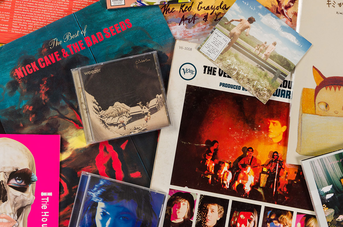
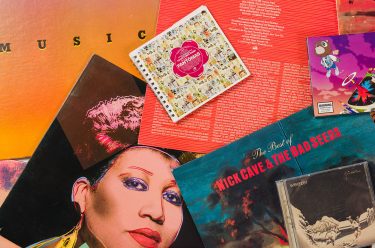
Spanning many major art movements — Sleevage: Collaborations between art and music — celebrates the unique and accessible art form of album sleeve art from the QAGOMA Library.
Creating a unified package of complex and intuitive meanings, these rich and imaginative miniature canvases have provided visual artists with populist exposure, and musicians the intellectual cachet that comes with being affiliated with such major artists as Andy Warhol, Garry Winogrand, Nobuyoshi Araki, Tony Clarke, Sol Lewitt, Robert Rauschenberg, Yoshitomo Nara, and many others.
Drawn from the Library’s collection gifted by Queensland artist Scott Redford and those in my personal collection, explore my Top 5 favourite art/music collaborations and visit us for Record Store Day on 12 June.
#5 Bridget Riley — ‘The Faust Tapes’ by Faust (1973)

Back Cover

I was surprised to be seen as a sort of representative of an aspect of the psychedelic culture. It was a collision between my intentions as an artist and the cultural context in which I found myself. I remember being told as though it was some sort of compliment that it was the greatest kick to go down and smoke in front of my painting.1
#4 Jenny Watson — ‘Send Me A Lullaby’ by The Go-Betweens (1981)

Back Cover

Seminal Brisbane band The Go-Betweens enlisted painter Jenny Watson to paint portraits for their debut album, Send Me A Lullaby (1981). Part-psychoanalysis, Watson’s portraits characterise the band’s interpersonal relations – Robert and Grant were best friends and Lindy, the band’s drummer, was Robert’s girlfriend. Reflecting on the portraits in his memoir Grant and I, Forster observed that ‘She got the three of us with precision, placing us on the album with the touch of a master psychologist’.2
The portraits were acquired in 2002 by the National Portrait Gallery of Australia and, like the streets of Brisbane, the portraits are considered a pilgrimage for The Go-Betweens’ fans.
#3 Henri Fantin-Latour+Peter Saville — ‘Power, Corruption & Lies’ by New Order (1983)

Back Cover

Both subversive and intriguing, New Order’s 1983 album Power, Corruption & Lies features Henri Fantin-Latour’s luxuriant still life A Basket Of Roses 1890 from the collection of the National Gallery, London. Wanting a kind of ‘Machiavellian image’, graphic designer Peter Saville juxtaposed a digital colour bar that could only be deciphered using the back cover’s colour wheel made up of 26 subdivisions of tints — each representing a letter of the alphabet denoting the album’s title.
Providing compact lessons in the history of art and design, Saville’s curatorial approach invited record buyers to see pop music and commercial graphics in the same register as fine art. The cover’s continued influence is still felt almost 40 years on from its release: From limited edition Raf Simons parkers, to streetwear icons Dr Marten boots and Supreme, to the Royal Mail’s inclusion in its 2010 Classic Album Covers of the last 40 years stamp collection.
#2 Julian Opie — ‘The Best of blur’ by blur (2000)

Back Cover

Blurring the visual languages of commercial art and public signage, British artist Julian Opie’s brightly coloured and ‘schematised’ portraits for Blur: The Best Of (2000) speak again to this alliance with popular culture.
Rendering Damon, Graham, Alex and Dave like a ‘multinational company with a logo’, Opie’s portraits effortlessly translated to in-store advertising, music magazines, bus and train livery, and the huge hanging backdrop that can be seen behind the band as they perform on BBC music TV show Later with Jools Holland.
Recognisable and distinct as any photograph could be, the portraits were acquired by the National Portrait Gallery in London and are firmly thought of as one of Opie’s most memorable and accessible works.
#1 Robert Rauschenberg — ‘Speaking in Tongues’ by Talking Heads (1983)

Back Cover

Recalling Robert Rauschenberg’s Shades 1964 and Revolvers 1967 sculptural, lithographic objects of the 1960s, the unconventional packaging of Talking Heads’ 1983 album Speaking in Tongues’ incorporates Rauschenberg’s characteristic mishmash of found imagery evoking American contemporary mass culture.
Pressed on to three separate Plexiglas —- one per primary colour — are fragments of scattered text and images of wrecked cars, highway billboards and suburban bedrooms, which can be endlessly configured by the listener.
Perfectly embodying Talking Heads’ densely layered approach to making music, the limited edition LP retailed for just $12.98 at the time — a real bargain for a Rauschenberg! The 12-inch vinyl record making the collection of the Museum of Moden Art, New York
Kristen Hayden is former Library Technician, QAGOMA Research Library
Endnotes
1 Michael Bracewell, ‘Seeing is Being,’ Frieze, issue 118, October 2008, p.263.
2 Robert Forster, Grant and I: Inside and Outside the Go-Betweens, Penguin 2007, p.102.
QAGOMA Research Library
The QAGOMA Research Library is located on Level 3 of the Gallery of Modern Art (GOMA). Open to the public Tuesday to Friday 10.00am to 5.00pm. visit us in person or explore the online catalogue. Access to special collections is available by appointment.
#QAGOMA

One of my favourite art/music collaborations was the one between Andy Warhol and Lou Reed and the Velvet Underground. When the latter released their debut album, The Velvet Underground & Nico, they used Warhol’s banana to adorn the LP cover. (Warhol also provided an unpeeled banana for the earlier LP which adds to the mystique of the collaboration.) I think the image is iconic. It is bold, brave, simple yet strong, suggestive yet random, timeless yet meaningless, aesthetic yet common. Moreover, the banana embodied the sound of this great band. Why do I think that? I see the banana and my mind makes a subtle connotation with evolutionary man as a primate. And the music The Velvet Underground made was raw and primitive on many levels while being unquestionably artistic. The image they used likewise is arguably low-brow and unpretentious while being very artsy and pretentious in another sense.
I also see the banana as an obvious phallic metaphor which symbolises the band’s rebelliousness and dark, confrontational quality. It is a virulent, tough and vibrant image which fits well the band’s hypnotic, stripped back sound, image and philosophy. The image seems rather unique for an album cover which is also fitting considering The Velvet Underground were avant-garde. This was an image which looked great not just on a record sleeve, but on a t-shirt or on a badge. Thus the image was a clever motif from a marketing and business perspective. For a band which mixed songs about kinky sex, drugs and life on the streets with the occasional sweet love song, the ‘in your face’, unadorned image of the banana seemed an extension of the sound itself. However, ironically, the banana to the unacquainted listener, also seemed to ask, ‘what does a band with artwork like that sound like?’
My favourite collaboration is Ernie Barnes and Marvin Gaye. Ernie Baines’ Sugar Shack painting was used as the cover art to Marvin Gaye’s 1976 album, “I Want You”. The artwork has a unique neo-mannerist style with elongation of figures and distinctive colour and movement. I can feel the rhythm in the artwork as well as the music, and both make me want to dance!