A lively group of seven woodblock prints representing Nagasaki-e and Kaika-e, made during the Edo (1615–1868) and Meiji (1868–1912) eras signal Japan’s radical transition from a closed economy to a modern, industrial nation.
Europeans first came to Japan in the 1540s and were initially welcomed. However, the Tokugawa shogunate grew concerned by news of Spanish colonisation in the Philippines, as well as the early popularity of Christianity in Japan. In 1641, the shogunate issued a series of edicts (officially termed Sakoku, or ‘closed country’) that limited trade and diplomatic contact. Sakoku prohibited Japanese citizens from travelling abroad, or entry for foreigners without special permission, on penalty of death.
Nishio Keiji ‘Silk mill at Kanazawa, Kaga Province’ 1874
Nishio Keiji, Japan, b. unknown / Silk mill at Kanazawa, Kaga Province (and detail) c.1874 / Woodblock print, ink and colour / Triptych: 34.5 x 23.8cm (each panel, approx.) / Purchased 2022 with funds from the Henry and Amanda Bartlett Trust through the QAGOMA Foundation / Collection: Queensland Art Gallery | Gallery of Modern Art
The port city of Nagasaki remained open to limited and officially sanctioned trade with small groups of Dutch and Chinese from 1641 to 1859, giving rise to the Nagasaki-e (Nagasaki School prints).1, 2 These prints often depicted foreign ships — the Chinese and Dutch vessels allowed to enter — as well as the people who came on them, their customs and mode of dress. Artists used natural pigments such as vermilion, red lead and indigo (the full range of colours, using multiple blocks, had not yet been developed). Sold by specialised publishers or booksellers in Nagasaki, Edo and Osaka, they were popular with both traders and curious residents — demonstrating ‘that although the country’s policy was to resist cross-cultural interaction, these encounters were happening nonetheless’.3 The genre declined in the late 1850s, when Yokohama replaced Nagasaki as a treaty port for foreign trade.
In 1854, the Treaty of Kanagawa ended the country’s 250 years of isolation and precipitated a change in government. By 1868, the last Shogun had resigned, and the Meiji era began. The Meiji Government focused on building transportation and communication networks, and on increasing its economic power by establishing factories and industry. Rapid modernisation was fuelled by the fear of becoming a colony under the control of a European nation.
A new genre of prints known as Kaika-e, or ‘prints of enlightenment’, emerged around 1868 and were produced into the 1890s, becoming ‘a popular vehicle to introduce specific symbols of modernisation and scenes of the changing Meiji civilization and cityscape’.4 The government encouraged the printing of these scenes and also published their own educational or instructive kaika-e. The use of imported aniline colours, including vibrant reds and greens, is indicative of the changing times.
Tsukioka Yoshitoshi ‘View of the train at Takanawa‘ 1871
Tsukioka Yoshitoshi, Japan, b. unknown / Takanawa tetsudo no zu (View of the train at Takanawa) (and detail) 1871 / Woodblock print, ink and colour / Triptych: 37 x 25.2cm (each panel, approx.) / Purchased 2022 with funds from the Henry and Amanda Bartlett Trust through the QAGOMA Foundation / Collection: Queensland Art Gallery | Gallery of Modern Art
Utagawa Hiroshige III ‘View of trading companies at Yokohama’ 1871
Utagawa Hiroshige III, Japan 1843–94 / View of trading companies at Yokohama (and detail) 1871 / Woodblock print, ink and colour / Triptych: 37 x 24.8cm (each panel, approx.) / Purchased 2022 with funds from the Henry and Amanda Bartlett Trust through the QAGOMA Foundation / Collection: Queensland Art Gallery | Gallery of Modern Art
Yoshitoshi’s View of the train at Takanawa 1871 (illustrated) celebrates the establishment of the railway line between Tokyo and Yokohama, officially opened by the Meiji emperor in 1872. Cities like Tokyo (where wood had been the predominant material for public and private dwellings) changed radically in appearance with the construction of Western stone building — including banks, department stores, government sites, factories and industrial buildings. Hiroshige III’s View of trading companies at Yokohama 1871 (illustrated) clearly indicates the end of the Sakoku, as trading companies begin to appear inside the city and the streets bustle with people and activity. Among lurid green buildings with splashes of red and indigo, Westerners and Japanese locals dressed in Western clothes are visible alongside the few still wearing traditional kimono.
The celebration of infrastructure and industry in Kaika-e can be seen as reinforcing the official stance of the government, but also importantly documented transformations in both custom and lifestyle at a time when old and new Japan intersected; and when the advanced techniques of Japanese printmaking collided with Western pictorial and visual languages and materials. In conjunction with the Nagasaki-e, these vibrant prints tell the story of a tumultuous and fascinating time in Japan’s long history and rich culture.
Utagawa Yoshifuji ‘View of the hotel at Tsukiji, Tokyo’ 1870
Utagawa Yoshifuji, Japan 1828–87 / Tokyo Tsukiji Hoterukan no zu (View of the hotel at Tsukiji, Tokyo) (and detail) 1870 / Woodblock print, ink and colour / Triptych: 36.6 x 25cm (each panel, approx.) / Purchased 2022 with funds from the Henry and Amanda Bartlett Trust through the QAGOMA Foundation / Collection: Queensland Art Gallery | Gallery of Modern Art
Abigail Bernal is Associate Curator, Asian Art, QAGOMA
Endnotes 1 The earliest surviving Nagasaki-e dates from 1740 and printing blocks have been found that were carved in the 1720s. 2 Some trade continued with Korea out of Tsushima Province and with the Kingdom of the Ryukyu Islands from Satsuma
Province. 3 Stephen Salel, Honololu Art Museum, viewed June 2022, <https://honolulumuseum.org/stories/2021/01/permanentcollection/others-the-depiction-of-foreigners-in-japaneseprints-
creating-art-in-an-era-of-isolation/> 4 Monika Hinkel, ‘Envisioning Meiji Modernity: Kaika-e’, Japan Society Proceedings, viewed June 2022, <https://eprints.soas.
ac.uk/36827/1/MonikaHinkel_Proceedings_Kaikae_2018.pdf>
The Japanese woodblock prints are on display in ‘I can spin skies‘ in the Queensland Art Gallery’s Henry and Amanda Bartlett Galleries (5&6) from 5 August 2023 until 23 June 2024.
Textiles have defined nationalities, facilitated cultural exchanges, and played a role in the rise and fall of empires, drawn from the QAGOMA Collection, the exhibition ‘I Can Spin Skies’ at the Queensland Art Gallery’s Henry and Amanda Bartlett Galleries (5 & 6) focuses on a breadth of textile practices — and art influenced by textile production — from across the broader geography and history of Asia.
In the thirteenth century, Sufi poet Rumi (1207–73)1 wrote a series of poems about the humble silkworm, eulogising the creature’s ability to ‘spin skies’; to create the thread that was one of the most prized commodities of the ancient world. While Rumi alludes to metamorphosis achieved through spiritual enlightenment, his poetry also hints at the importance of textiles to transnational exchange during his lifetime and beyond.
Cloth, whether woven from silk, cotton or other fibres, has been the second most traded object in world history, outclassed only by grain. The commercial exchange of textiles for ritual, decoration, status or everyday use has defined nationalities, facilitated cultural exchanges, and played a role in the rise and fall of empires. In more recent times, many contemporary artists have used cloth in their practice to allude to these larger stories and subtexts. Bringing together a diverse range of practices and mediums, ‘I can spin skies’ features works dating from the second or third century CE to the 2020s, and covering a vast geography from West, Central, East, South and South-East Asia.
Puttapaka Weaver ‘Telia rumal with clocks and planes’ c.1990s
Whether artists incorporate cloth or refer to it obliquely, textiles and fabric are a key consideration or motif that connect across the works in the exhibition. For example, a unique and fascinating collection of nineteenth- and twentieth-century telia rumal double-ikat cloths from south-eastern India (illustrated) speak of little known cultural and trade ties, combining Arab or Islamic motifs with modern symbols like aeroplanes or gramophones. Kawayan de Guia’s Revisiting his ego’s grave 2018 (illustrated) places an Indigenous Cordilleran textile (used in rites of passage) beneath a bul-ul (ancestor figure) who is shown being operated on by Western surgeons, an implicit criticism of the way Indigenous values have been misinterpreted and manipulated in a society that values capital over humanity.
Almagul Menlibayeva’s Wrapping history 2010 (illustrated), from her ‘My silk road to you’ series, acknowledges Kazakhstan’s Islamic heritage and rich cultural histories, as well drawing on Eurasian nomadic cosmologies and pre‑Silk Road textile histories. Outlined against the facade of a decorative mosque, a single female figure is shown shrouded in the voluminous whorls of a vast ikat cloth. Zahra Imani’s appliqué wall-hangings are rendered in fabrics found in home environments in Iran. She intentionally ties her work to a history of domestic handicraft — frequently undertaken by women — incorporating references to Persian and European painting through her figurative and humorous scenes.
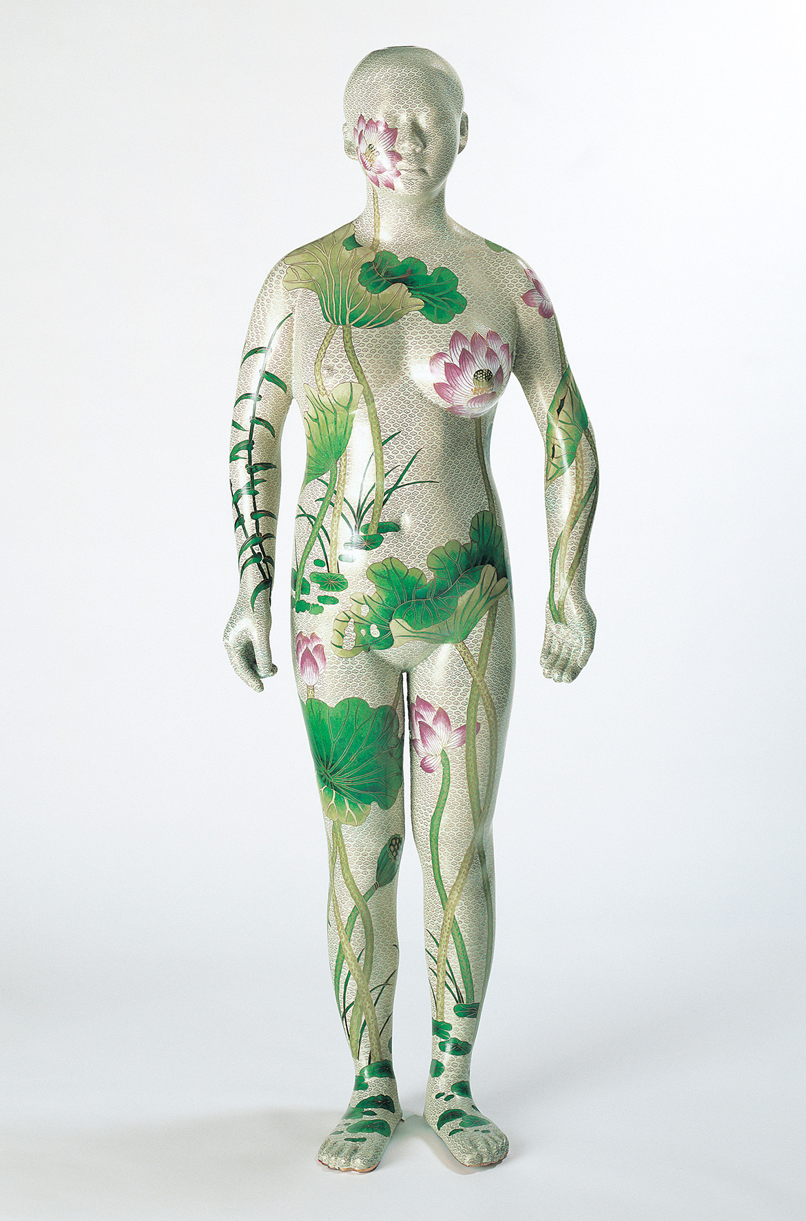
The high status associated with silk in China is subverted in Wang Jin’s Robe 1999. Based on a Peking Opera robe once made in silk and delicately embroidered with waves, clouds and dragons, the artist has re-created it in plastic and nylon fishing thread, giving the robe a ghostly, synthetic presence. Silk also played a central role in Japanese society, Japan being the largest exporter after China. In the exhibition, a group of prints, scrolls, photographs and textiles revolve around the economic and social importance of silk. In both China and Japan, silk was used as a base for painting and for important documents (the first paper was made with silk pulp and other fibres). During the Meiji era, it was one of the initial products to be industrialised at scale, and facilitated Japan’s move towards becoming to an industrialised, capitalist nation.
Finally, ‘I can spin skies’ highlights the broader legacies of the silk trade, which enabled the dissemination of religions such as Islam and Buddhism. It features Buddhist sculpture from Japan, Thailand and Gandhara, with ceramics from South-East Asia, and works on paper from the Islamic world — items often created or exchanged during the foundational eras of global trade and exchange in which textiles were worth their weight in gold.
Abigail Bernal is Associate Curator, Asian Art, QAGOMA
Endnote 1 Jalal al-Din Rumi was an Islamic Sufi poet who authored some 60 000 lines of poetry, lectures, sermons, and letters in Persian and Arabic, and who founded the Mevlevi (Mawlawiyya) dervish order.
Miyagawa Chōshun ‘Hanging scroll: Courtesan and maid’ 18th century
Miyagawa Chōshun 1682 – 1753 / Hanging scroll: Courtesan and maid 18th century / Ink and colour on silk / 118.7 x 48.7cm38.5cm (diam., comp.) / Gift of James Fairfax AC through the QAGOMA Foundation 2018 / Collection: Queensland Art Gallery | Gallery of Modern Art
Ah Xian ‘Human human – lotus, cloisonné figure 1’ 2000-01
Philippines-based artist Lee Paje’s two oil on copper works — a triptych The stories that weren’t told 2019 and Somewhere, someday when we are the sea 2021, a suspended 12-panel polyptych — were commissioned for ‘The 10th Asia Pacific Triennial of Contemporary Art’ (APT10).
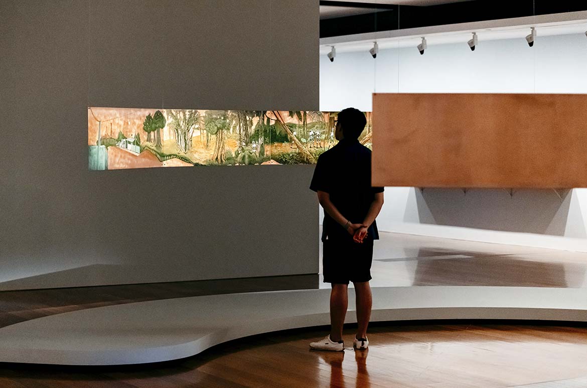
The Stories that Weren’t Told 2019 (illustrated) shows an imaginary landscape, melding elements from Filipino and Judeo-Christian origin myths into a hybrid creation story that envisages a new form of paradise. This exquisitely executed triptych painting on copper panels, which took more than three months to complete, draws on and transforms a formative childhood memory for Paje.
Stories are an important part of our lives. Growing up, stories are told to make sense of things and teach the way to live. They shape our beliefs about ourselves and others. They colour the lens through which we see the world. Lee Paje1
When she was six, Paje was ill and made frequent visits to a children’s hospital in Quezon City. At this young and impressionable age, she often passed a huge mural, one of many artworks commissioned to decorate the hospital’s walls. The mural illustrated a creation myth from the pre-Spanish, pre-Catholic era, in which the first humans — a man and a woman — emerged from the two halves of a split stalk of bamboo.2 Marvelling at the image, Paje asked the nurses in the hospital what it meant; she was told it indicated how a man and woman were made for each other, as two parts of one whole. The title of the Tagalog origin myth, Malakasat Maganda, translates loosely as ‘The Strong and the Beautiful’, with the desirable attributes for each gender implied by the title. Even at such a young age, Paje felt she did not fit the mould or aspire to its outcome.
The Stories that Weren’t Told is Paje’s response to the story of Malakas at Maganda. Throughout her practice, she has painted on copper — a now uncommon medium that was frequently used by artists during the Renaissance prior to the introduction of canvas and is particularly associated with grand narratives. Paje was attracted to copper for its link to Bible stories that reinforce gender stereotypes, as well as for its durability. The copper allows her to assert the ongoing loyalty and endurance of her work and her resolution that it will continue to challenge prevalent social, historical and cultural stereotypes.
Her triptych shows a landscape combining elements of tropical and temperate vegetation, with fruit trees and bamboo, around a central pool or lake. The copper shines through the paint, forming part of the composition and lending a luminousness to the scene. The landscape is populated by a group of primordial beings, unbound by gender, envisaged by Paje as human outlines filled with limitless and mysterious seascapes, like portals into the unknown. These beings are able to cast off the skin that defines their gender and identity as though it were a piece of clothing. In the foreground is a single primordial figure whose recognisably female skin lies on the ground near a half-eaten apple — the Christian symbol of original sin that saw Adam and Eve expelled from Paradise into a world of hardship and evil. In Paje’s painting, Eve’s sin has already taken place, yet humans still occupy this new paradise. A couple identifiable as Adam and Eve stand beneath a fruit tree. On the left, fluid ungendered humans emerge from stalks of bamboo in pairs while, in the far background, smoke rises from a city in flames.
Lee Paje ‘Somewhere, someday when we are the sea’ 2021
Stemming from the themes and symbols in her triptych, Somewhere, someday when we are the sea 2021 (illustrated) takes the form of a polyptych (historically an altarpiece of linked panels). Each panel is linked and suspended from the ceiling to allow the viewer to physically enter the space of the painting and to create an immersive experience. In Paje’s words:
A continuous landscape of different topographies forms once the panels are united. Viewers are invited to enter, traverse the space, partake in the journey with the primordial beings that roam the landscape and, perhaps, glimpse a paradise, a future.3
For the artist, the contrasting experiences of the polyptych and the triptych are significant, as the bodily mode of engagement contributes to an understanding of the way we ‘receive, remember and render signals from social, economic and cultural constructs’.4 The viewer becomes the thread that ties the two works together and connects the meaning of the whole. Within this liminal space, with its forest and glades and vast internal seascapes, we are able to re-create the stories we were told and imagine new ones that represent us.
Abigail Bernal is Associate Curator, Asian Art, QAGOMA
This is an extract from the QAGOMA publication The 10th Asia Pacific Triennial of Contemporary Art available in-store and online from the QAGOMA Store.
Endnotes 1 Lee Paje, artist statement emailed to the author, 29 May 2021. 2 The mural by artists Victor Cabisada and Peter Alcántara, Si Malakas at si Maganda 1980, is at the Philippine Children’s Medical Center, Quezon City. 3 Paje. 4 Paje.
Amy Lien and Enzo Camacho have been collaborating for more than 12 years, their shared practice is oriented around intensive first-hand research into the impact of globalism, capital and development on specific small-scale communities. Since 2018, they have made a number of works based on the sugar plantations on the island of Negros in the Philippines. Established during the Spanish colonial period, the plantations reinforce an entrenched and brutal class system.
One of the best known sugar manufacturers on Negros is the Victorias Milling Company. In 1950, the company commissioned the Filipino-American modernist painter Alfonso Ossorio, the son of the company’s founder, to create a mural in a chapel servicing the workers of the sugar mill. Powerful and unsettling, yet widely loved and admired, it is popularly referred to as the Angry Christ. For Lien and Camacho, Ossorio’s mural resonates with much of the latent violence and oppression of the plantation system through its radical reworking of Catholic sentiment. Its central figure, with fiery eyes and outstretched arms, appears flayed, his clothing more like skin, muscle and sinew, his heart wrapped in thorns and flames, and a snake and skull lie at his feet.1
Watch | Installation time-lapse
Amy Lien, United States b.1987; Enzo Camacho, The Philippines b.1985 / The Angry Christ (Plot and Plantation) 2021
For ‘The 10th Asia Pacific Triennial of Contemporary Art’ (APT10), Lien and Camacho created a group of interrelated works that spin out from the mural to explore the implications of the global plantation system, and its roots in a dehumanised market economy that has given rise to many forms of contemporary violence and accelerated environmental threat.
The centrepiece, The Angry Christ (Plot and Plantation) 2021, is a re-imagined folding altarpiece or retable, constructed from raw timber and inset with inked rice paper paintings showing details from Ossorio’s mural and the artists’ own photographs of workers harvesting cane by hand. The fragmented images imply a painterly metanarrative of cutting and piecing echoed in the steel blades of the knives held by the depicted workers. The retable itself, with its folding wings, implies ‘motion, mutability, transformation’ and, in the artists’ words, takes ‘the existing mural off of the wall, reactivating it by “folding it out” in different directions’.2
Operating in conjunction with the folding retable are a group of ‘handmade papers’. These works are made with sugarcane fibres from Negros, combined with a range of other materials including wax, watercolour or gouache, coconut and rice hulls, seaweed, wood ash, abaca, corn husk, banana peel, scallions and onion skins.3 In creating these works, Lien and Camacho were inspired by theorist Sylvia Wynter and her discussion of the garden plots planted by African slaves in the Caribbean as the sites of eventual ‘cultural guerilla resistance’.4 These works take up the concerns of plot and plantation by indexing the sugar ecology of Negros and suggesting alternative narratives.
While many of the symbols in their drawings are structured around references to Ossorio’s mural — the skull, snake, the flaming heart — the artists have introduced one element not employed by Ossorio. The body of a lion surrounded by a swarm of bees is taken from the Old Testament biblical narrative in which Samson finds a beehive in a lion‘s carcass, and collects some honey to eat. He created a riddle arising from this experience: ‘Out of the eater, something to eat; out of the strong, something sweet’.5 After adopting this symbol of transformation, the artists later discovered it had been appropriated as a logo in the 1880s by the British sugar-refining company Abram Lyle & Sons. This riddle within a riddle echoes the ongoing potential of Lien and Camacho’s works to generate new meanings and to delve deeper into the insurgent potential of art.
Abigail Bernal is Associate Curator, Asian Art, QAGOMA This is an edited extract from the QAGOMA publication The 10th Asia Pacific Triennial of Contemporary Art available in-store and online from the QAGOMA Store.
Endnotes 1 Their initial research was presented as an artist lecture and mural for the NTU Center for Contemporary Art in Singapore (2019), and subsequently as a mural and group of works on paper at SOAS University of London. 2 Amy Lien and Enzo Camacho, email to the author, 18 March 2021. 3 The drawings take as their point of departure Ossorio’s series of wax-resist ‘Victorias Drawings’. 4 Sylvia Wynter, ‘Novel and history, plot and plantation’, Savacou, no.5, June 1971, pp.95–102. 5 The answer, composed like a riddle itself, is ‘What is sweeter than honey? What is stronger than a lion?’
Rocky Cajigan draws on the rich cultures of the Philippines’ Cordillera region to explore aspects of indigeneity, ethnography and decolonisation. His installations and assemblages are characterised by a profusion of objects which call attention to the hybrid contexts from which they arose, hinting at prior narratives and histories. Their juxtaposition allows Cajigan to build up layered and textured meanings.
Since 2017, Cajigan has created a group of works based on the backstrap weaving loom, a device used in communities across South-East Asia, including the Cordillera region. He recalls his great aunts and uncles weaving customary Bontoc garments on these looms, in which the weaver fastens the warp of threads around their own waist. Such textiles continue to have deep ceremonial and social significance, and each garment displays unique motifs and associated symbolism that have developed over centuries, long preceding colonisation.
Watch | Installation time-lapse
Rocky Cajigan, Fontok and Kankanaey people, The Philippines b.1988 / Hairloom 202
Cajigan’s site-specific and ephemeral loom works responded to local histories. Hairloom 2021, on display in ‘The 10th Asia Pacific Triennial of Contemporary Art (APT10), takes the form of a backstrap loom constructed from human hair and wooden loom tools, overlaid on open-weave gauze. Cajigan collected the hair from salons in the towns of La Trinidad and Bontoc. Through a time-consuming and painstaking process, he and his assistants treated and glued the hair together in larger strands, weaving through coloured threads, until it formed a kind of warp and weft for a reimagined loom more than 12 metres long.
Suspended from the wall at a height, it is weighted with blocks made from sandstone piedras once used by the Spanish colonisers to build roads and churches. In addition, garments woven from muslin gauze, the kind used to bandage a wound, are suspended on metal poles, capped with carved wooden hands and hung from butcher hooks. A woven shirt, which closely resembles a Cordilleran style of textile, was in fact made in Guatemala, and is fringed with white human hair to form a new object of material culture. Through Hairloom, Cajigan literally weaves together the DNA strands of his ancestry.
A painting of a rice-storage structure, enclosed in a box frame with steel hardware and etched glass, is titled Case of Emergency (Dalican, Bontoc, Mountain Province 2616 Philippines) 2021. With food in short supply during the COVID-19 pandemic, further human rights abuses against indigenous communities escalated, while bribery and corruption were rife. This synthesis of hybrid objects is characteristic of Cajigan’s practice and creates a strong narrative on indigeneity and cultural fusion, on the wounds within and homogenisation of cultures, but also their ongoing vitality and resilience.
Abigail Bernal is Associate Curator, Asian Art, QAGOMA This is an edited extract from the QAGOMA publication The 10th Asia Pacific Triennial of Contemporary Art available in-store and online from the QAGOMA Store.
Queensland-born artist Gordon Bennett (1955–2014) was deeply engaged with questions of identity, perception and the construction of history, and made a profound and ongoing contribution to contemporary art in Australia and internationally.
To me, the image of Eddie Mabo stood like the eye of a storm, calmly asserting his rights while all around him the storm, a war of words and rhetoric, raged. Gordon Bennett
A riot is the language of the unheard. Martin Luther King1
Bennett developed a unique form of appropriation and is known for his layering and repetition of elements from paintings by artists such as Kazimir Malevich, Piet Mondrian, Philip Guston, Margaret Preston and Jackson Pollock, as well as his sustained dialogue with the work of Haitian–American artist Jean-Michel Basquiat. These exchanges and excavations enabled Bennett to address the legacies of Western art and its relationship to colonial perspectives on non-Western cultures. One previously unexamined intersection is with the work of American artist David Hammons.
On 2 June 2020, ‘Blackout Tuesday’, there was an international expression of solidarity with the Black Lives Matter (BLM) protesters in the United States, following the murder of George Floyd. In Australia, Blackout Tuesday preceded Mabo Day on 3 June — a commemoration of Indigenous activist Eddie Koiki Mabo (1936–92) and his decade-long fight for the recognition of traditional ownership of the land.2
David Hammons ‘African-American Flag’ 1990
David Hammons, United States b.1943 / African-American Flag 1990 / Dyed cotton / 150 x 234cm / Collection: The Broad Art Foundation / Image courtesy: The Broad Art Foundation, Los Angeles
The alignment of dates seemed fitting, drawing attention to the way in which racial prejudice and violence in the United States mirrors Australia’s ongoing issues with Indigenous rights, including Aboriginal deaths in custody.3 To mark Mabo Day 2020, Gordon Bennett’s painting Eddie Mabo (After Mike Kelley’s ‘Booth’s Puddle’ 1985, From Plato’s Cave, Rothko’s Chapel, Lincoln’s Profile) No.3 1996 was projected at vast scale against the National Carillon on Lake Burley Griffin in Canberra.4 Coincidentally also the day Bennett passed away in 2014, it was a fitting tribute to two men — one an activist, the other one of Australia’s most highly regarded contemporary artists — who fought for humanity and justice in different ways.
In the United States, another artwork became associated with the BLM protests: David Hammons’s African-American flag 1990 was posted on social media and replicas were carried by demonstrators. First created for an exhibition in 1990, the flag combines the stars and stripes of the US flag with the red, green and black of the Pan-African flag.5 A hybrid creation, the ironic juxtaposition of elements draws attention to an uneasy coexistence, while also acting as a symbol of strength, resistance and unity to people of African- American descent.
Kazimir Malevich, Russia 1879–1935 / Hieratic Suprematist Cross (large cross in black over red on white) 1920–21 / Oil on canvas / 84 x 69.5cm / Collection: Stedelijk Museum Amsterdam
Gordon Bennett encountered David Hammons’s work as early as 1990, and mentioned him as an influence in his private notebooks. In June 1990, Bennett travelled to Amsterdam for the centenary exhibitions associated with Vincent van Gogh’s death.6 Then, on 9 June, he visited the exhibition ‘Black USA’ at Amsterdam’s Museum Overholland, writing in his notebook that it was ‘practically deserted, no line-ups, no crowds’.7 Identified as a watershed moment in art history, the exhibition included work by seven artists: David Hammons, Jules Allen, Benny Andrews, Romare Bearden, Robert Colescott, Martin Puryear and Bill Traylor. Hammons’s African-American flag, created specifically for the exhibition, flew outside the museum’s front door. In the days prior, Bennett had been viewing the abstract paintings of Russian artist Kazimir Malevich at the Stedelijk Museum. Malevich’s most renowned work is Black Square 1915, often regarded as the pinnacle of ‘pure abstraction’. In ‘Black USA’, however, black shed its formalist association with transcendence and purity and instead related to the skin, bodies and experiences of Black Americans. In addition, the works disrupted formalist readings of abstraction by alluding to blood, gunshots and lynchings, and through the use of materials connected to incarceration and slavery, such as wire and nooses.
Gordon Bennett ‘Notebook sketch after David Hammons’ 1993
Both Hammons and Bennett began practising as artists at times when issues of sovereignty and civil rights were coming to the fore in their respective countries. Hammons’s ‘body prints’, like America the beautiful 1968 or Spade (Power for the spade) 1969, were made after Martin Luther King’s assassination in 1968, which sparked violent uprisings and race riots across the country. In Australia, Bennett graduated from college in 1988 — the bicentenary year marking Captain James Cook’s ‘discovery’ and ‘possession’ of Australia7 — and witnessed historic moments such as the Mabo decision of 1992, which led to the Native Title Act 1993. Paintings such as his Possession Island 1991, Outsider 1988 and Myth of the Western Man (White man’s burden) 1992 directly refer to these events.
Bennett made two sketches for works ‘after David Hammons’ in 1993. Both related to Hammons’s series of ‘spade’ works, which played on the literal and derogatory meanings of the word. For Hammons, the spade symbol (like that seen on playing cards) encapsulated and signified ‘blackness’ and the experience of being Black in America. One of Bennett’s sketches directly alluded to Hammons’s Spade with chains 1973, a wall-based work made from an actual tool looped with chains, suggesting a makeshift African mask, the destruction of culture and a history of slavery. Bennett’s sketch showed a rectangular spade with chains on either side, threaded with blank cards that he planned to write or paint on. This spade would later morph into a stockman’s whip, more accurately representing Australian colonial history, hung with the same cards and the letters a/b/c/d (Bennett’s cipher for the derogatory words ‘abo, boong, coon, darkie’). The stockman’s whip became part of his ‘Welt’ painting Self‑portrait interior/exterior 1992 and was also a component of Self-portrait (Suit) c.1995. These black, scarified, ‘poxed’ and cut works also included the triptych Bloodlines 1993, with its central panel of red oxide‑stained nooses alluding to Aboriginal deaths in custody.
Bennett’s ‘Altered body print’ series of 1993–94 also points to Hammons’s body prints, in keeping with his practice of visual quotation and re-presentation. In the late 1960s, Hammons used margarine to grease his body, hair and clothing, before rolling on a sheet of paper, leaving an imprint that he then sprinkled with black pigment. The resulting images — seen in Spade (Power for the spade), for example — appear violently compressed and downtrodden, in keeping with prevalent racial and class stereotypes. (One of Hammons’s most shocking images, Injustice Case 1970, alludes to the silencing of Black Panther Bobby Seale during his trial.) For his ‘Altered body print’ series, Bennett painted his skin black, and pressed his chest, hands, pelvis, thighs and feet onto canvas or paper while supporting his weight on his arms. The impressions he left were distorted and splayed, suggesting a kind of dismemberment. While Hammons used grease for its association with the everyday, Bennett’s works alluded to Aboriginal body painting as well as Yves Klein’s Anthropometries series of 1960, creating works that fused European, colonial and Indigenous references.
Gordon Bennett’s ‘Body prints’ performance in the Petrie studio 1994
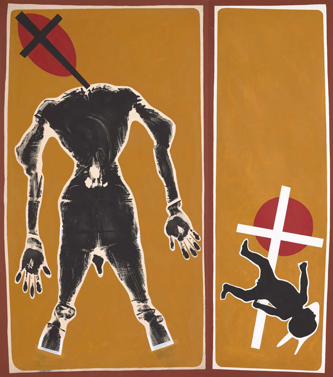
Like Hammons’s Spade (Power for the spade), Bennett’s diptych Altered body print (Purity of hybrids) 1994 raises questions of race, skin and identity. On the left panel, a headless figure with disjointed limbs appears against an ochre background, accompanied by Kazimir Malevich’s crucifix symbols in red and black — a repeating motif in Bennett’s practice, signifying both the association of abstraction with purity and the Christianity imposed on a colonised and subjugated people. The outline of a falling baby on the right is perhaps a reference to the Stolen Generation, as well as the recent birth of his daughter and his fears that she would be subject to the same experience of racism he had encountered.
Bennett and Hammons shared a similar visual language and a humanist desire to participate in the creation of a better world. Hammons expressed his sense of a ‘moral obligation as a black artist to try to graphically document what I feel socially’, while Bennett acknowledged his foolishness in wanting to create ‘the one painting that will change the world, before which even the most narrowminded and rabid racists will fall to their knees in profound awareness and spiritual openness’.8 Adopting objects, symbols and materials as signifiers of Black and Indigenous bodies, cultural histories and identities, each played on the ‘slipperiness and subterfuge’ of language, creating provocative works that have been highly influential on following generations of artists.9
David Hammons and Gordon Bennett grew increasingly reticent as their careers progressed, refusing to be interviewed or to attend openings. Both artists felt trapped by the association of their work with ‘blackness’.10 To see their artworks reappear in the context of Black Lives Matter highlights both the ongoing pertinence of their practices and how very far we have yet to go.
Abigail Bernal is former Assistant Curator, International Art, and co-curator of ‘Unfinished Business: The Art of Gordon Bennett’.
Endnotes 1 See Lily Rothman, ‘What Martin Luther King Jr really thought about riots’, Time, 28 April 2015, https://time.com/3838515/baltimore-riotslanguage- unheard-quote/, viewed 3 July 2020. 2 Mabo day marks the anniversary of the historic Mabo decision of 1992, when it was decided that the Mer people (from Murray Island) were the traditional owners of the land. This was a significant ruling which refuted the idea of terra nullius and led to the Native Title Act 1993. 3 This confluence was also acknowledged in the social media hashtags #blacklivesmatter and #indigenouslivesmatter associated with demonstrations in Australia. 4 The National Carillon was a gift from the British Government to the people of Australia to celebrate the 50th anniversary of the national capital. Queen Elizabeth II accepted the National Carillon on behalf of Australians on 26 April 1970. 5 Marcus Garvey’s Pan-African Flag with three horizontal stripes in black, red and green was first adopted by the Universal Negro Improvement Association and African Communities League in 1920. The colours are symbolic, with red for blood, black for skin, and green for the fertile land they forcibly left behind. David Hammons’s flag was initially created as an edition of five, and there are a number of subsequent variations on the theme in public collections in the United States and Europe. 6 The Museum Overholland was in a prominent position, surrounded by the Rijksmuseum, the Van Gogh Museum, the Stedelijk Museum, and also the US Consulate General, making Hammons’s flag even more politically apt and the lack of crowds during the Van Gogh centenary more notable. 7 As with other countries ‘discovered’ and colonised by European explorers, the celebration of this moment excluded First Nations people, denying their long habitation of the land and the history of violence that followed. 8 Gordon Bennett quoted in Bernhard Luthi (with Gary Lee), Aratjara: Art of the First Australians: Traditional and Contemporary Works by Aboriginal and Torres Strait Islander Artists [exhibition catalogue], DuMont, Koln, 1993, p.91. 9 Gabriel Cox, ‘David Hammons’, Art Review, May 2016, https://artreview.com/may-2016-feature-david-hammons/, viewed 3 July 2020. 10 Hammons jokingly remarked that he would love to make works with light like James Turrell, but he was not ‘free’. His full comment was: ‘[Turrell’s] got a completely different vision. Different than mine, but it’s beautiful to see people who have a vision that has nothing to do with presentation in a gallery. I wish I could make art like that […] I would love to do that because that also could be very black. You know, as a black artist, dealing just with light. They would say, “How in the hell could he deal with that, coming from where he did?” I want to get to that, I’m trying to get to that, but I’m not free enough yet. I still feel I have to get my message out’. See ‘David Hammons turned off the lights in an empty gallery. What happened next was a masterpiece’, Artspace, 9 March 2016, https://www.artspace.com/magazine/art_101/book_report/davidhammons-phaidon-dca-excerpt-53590, viewed 20 August 2020.
Acknowledgment of Country
The Queensland Art Gallery | Gallery of Modern Art (QAGOMA) acknowledges the traditional custodians of the land upon which the Gallery stands in Brisbane. We pay respect to Aboriginal and Torres Strait Islander elders past and present and, in the spirit of reconciliation, acknowledge the immense creative contribution Indigenous people make to the art and culture of this country. It is customary in many Indigenous communities not to mention the name of the deceased. All such mentions and photographs on the QAGOMA Blog are with permission, however, care and discretion should be exercised.
Featured image detail: Gordon Bennett Possession Island 1991
#QAGOMA
We acknowledge the Traditional Owners of the land on which the Queensland Art Gallery | Gallery of Modern Art stands and recognise the creative contribution First Australians make to the art and culture of this country.


 1871")
 1871")


 1870")
 1870")

 2018")


 2021")


 2021")
 2021")
 2021 by Amy Lien and Enzo Camacho")
 2021 by Amy Lien and Enzo Camacho")


 1995")

 1920–21")


 1969")

 c.1995")