We take you on a journey of discovery beneath the paint surface of The Blue Alice 1956-57, uncover previously hidden details, and look at the technique and materials used by Charles Blackman.
The Blue Alice is currently on display in the ‘Fairy Tales’ exhibition at Brisbane’s Gallery of Modern Art (GOMA) until 28 April 2024.
‘Fairy Tales’ unfolds across three themed chapters. ‘Into the Woods’ explores the conventions and characters of traditional fairy tales alongside their contemporary retellings. ‘Through the Looking Glass’ brings together art, film and design that embrace exploratory stories of fantastical parallel worlds. ‘Ever After’ brings together classic and current tales to explore the many dimensions of love in all its complexities.
Buy Tickets to ‘Fairy Tales’
Until 28 April 2024
Gallery of Modern Art, Brisbane
Watch | ‘Through the Looking Glass’
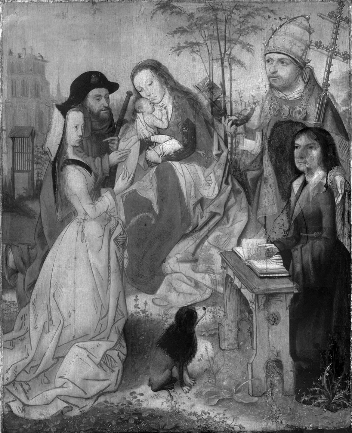
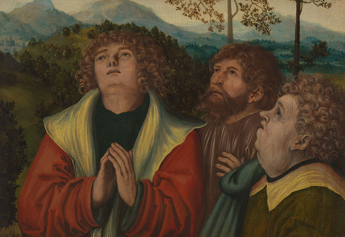
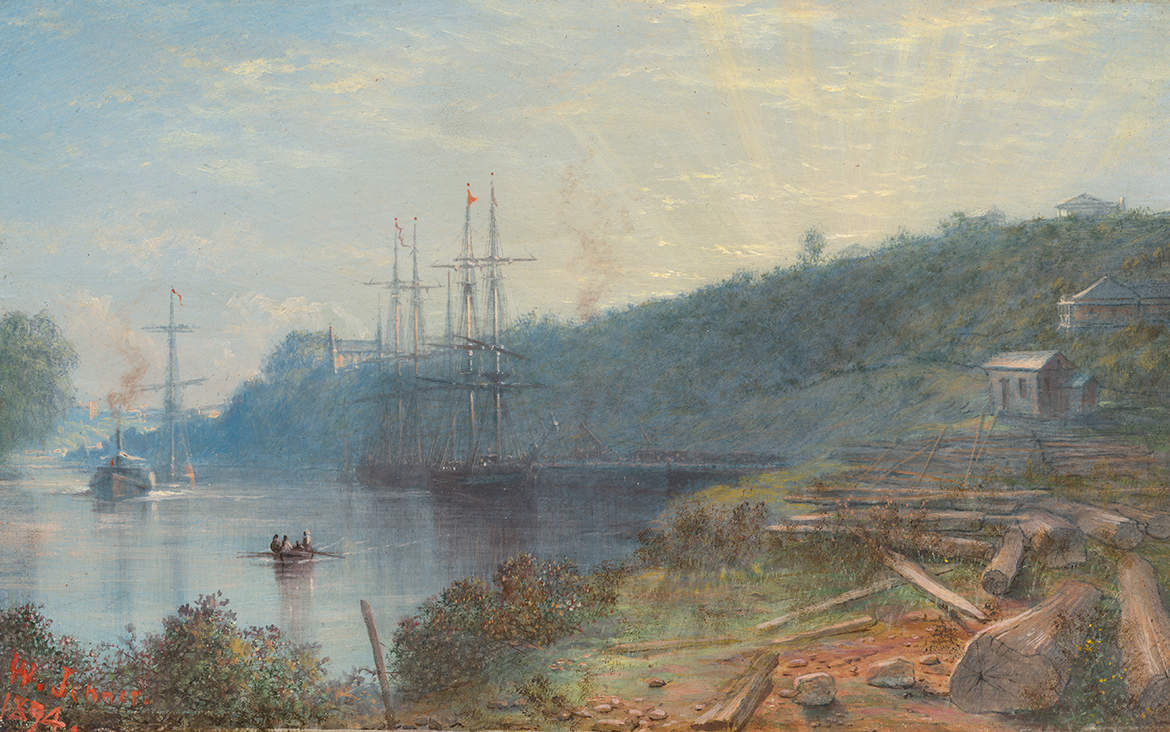
Charles Blackman ‘The Blue Alice’ 1956-57
In April 1956, inspired by Lewis Carroll’s classic books Alice’s adventures in Wonderland 1865 and Through the Looking Glass 1872, Charles Blackman (12 August 1928-2018) began what would eventually become a series of forty-one works. This ‘Alice in Wonderland’ series was painted in Melbourne between 1955 and 1957 and completed in Brisbane in 1957.

The first painting of the ‘Alice in Wonderland’ series, The Blue Alice 1956-57 (illustrated) was one of only five paintings sold at Blackman’s 1957 exhibition in Melbourne when this series was first exhibited 1. It likely retains its original frame made and designed by Martin Smith, then one of Melbourne’s leading framers 2. The Blue Alice was acquired by the Gallery in 2000, and is in fact the first painting acquired by QAGOMA this century.
It is an intriguing painting. Alice is depicted in a sleep like state with eyes closed, standing off balance on one leg and holding a bouquet of flowers. The white rabbit, a looking glass, door mice and other creatures are with her in a field of flowers devoid of perspective.
Blackman has described the ‘Alice in Wonderland’ paintings as probably the freest pictures he ever painted — they involved a process of wrestling with paint and ideas — painting them was like ‘carving them out of a tree with an axe’ 3.
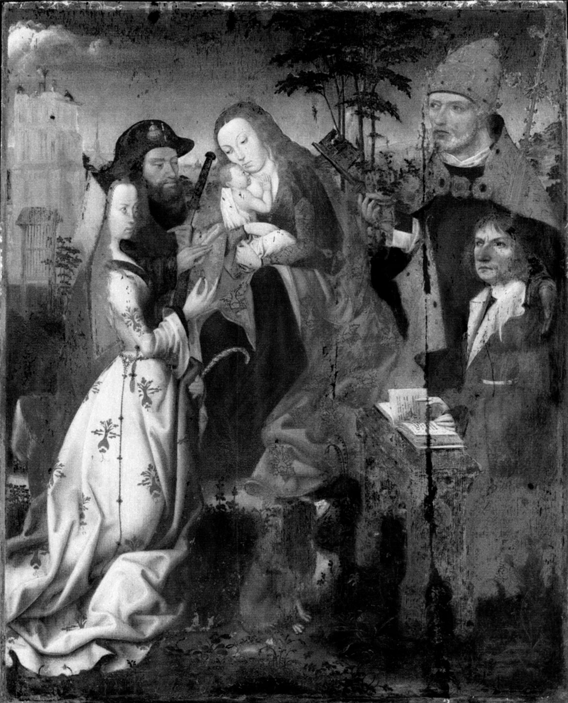
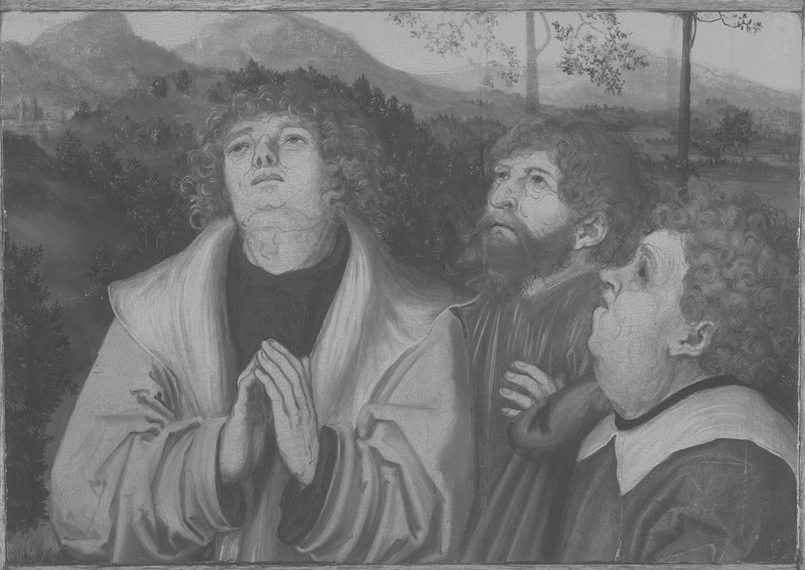
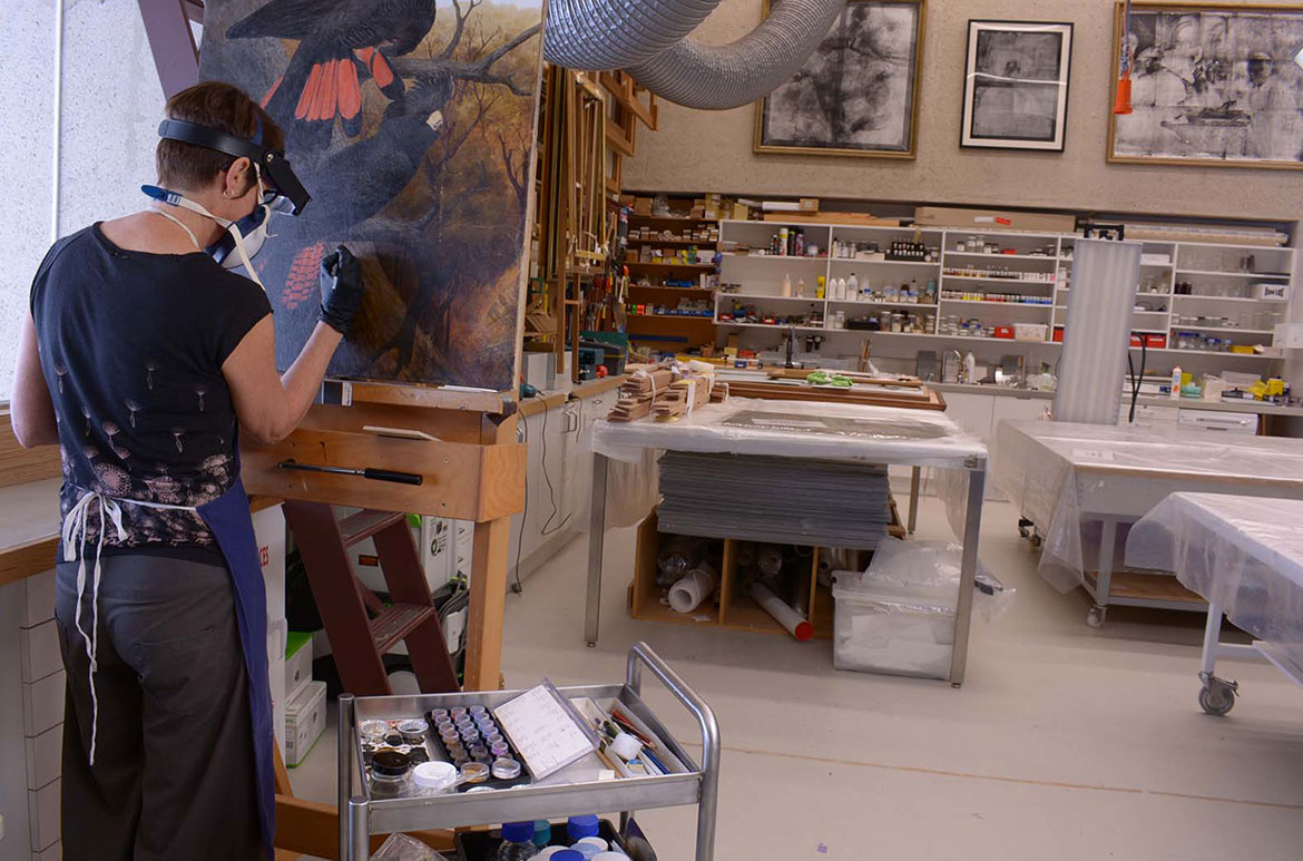
Looking at The Blue Alice, you can see this process of wrestling with the paint. For example, there are various brushstrokes that can been seen under the top paint layers which do not relate to the image on the surface. X-radiographs undertaken by the conservation section by Anne Carter and Mandy Smith in 2000, revealed that the artist made many changes and iterations to the composition (Illustrated).
X-ray of ‘The Blue Alice’

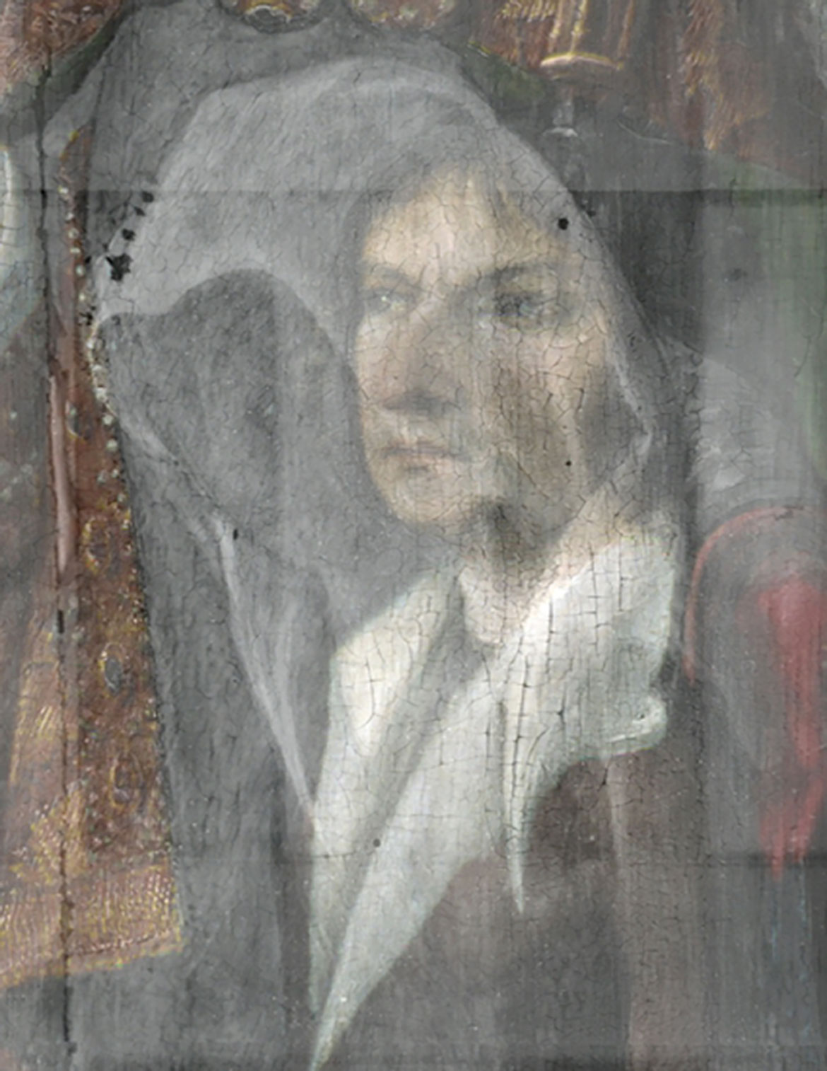
The Blue Alice appears to have started out as a painting from his earlier ‘Schoolgirl’ series. In the 1950’s Blackman had made a series of works depicting groups of schoolgirls wearing typical uniform hats and we can see in the x-ray that the main figure originally wore a hat which has been painted out. This hat sits on a previously larger head, just visible in the x-ray (Illustrated).
In the x-ray we can also see changes to Alice’s face. Originally Alice looked directly at the viewer, but in the final painted image she is seen in profile with closed eyes. Alice’s painted-out eyeball is just apparent under the closed lid of her eye (Illustrated). Blackman has cut in this side profile of Alice’s face with a dark coloured paint and filled it with flowers to camouflage this change (Illustrated).
X-ray showing hat & Alice looking directly at the viewer

Painted-out eyeball


The rabbit is completely invisible in the x-ray, however a pole is seen in its place (Illustrated), we can only guess at its significance. The pole rather than the rabbit is visible in the x-ray because it is painted in lead white which blocks x-rays from exposing the film — a heavier element to titanium white of the rabbit. The background field of flowers continues under the pole, the door mice and all the other creatures, indicating that those elements of Alice’s story were painted over an initial background of flowers. Other previous architectural features such as horizon lines are also visible in the x-ray.
Flowers extend under the rabbit

x-ray showing pole

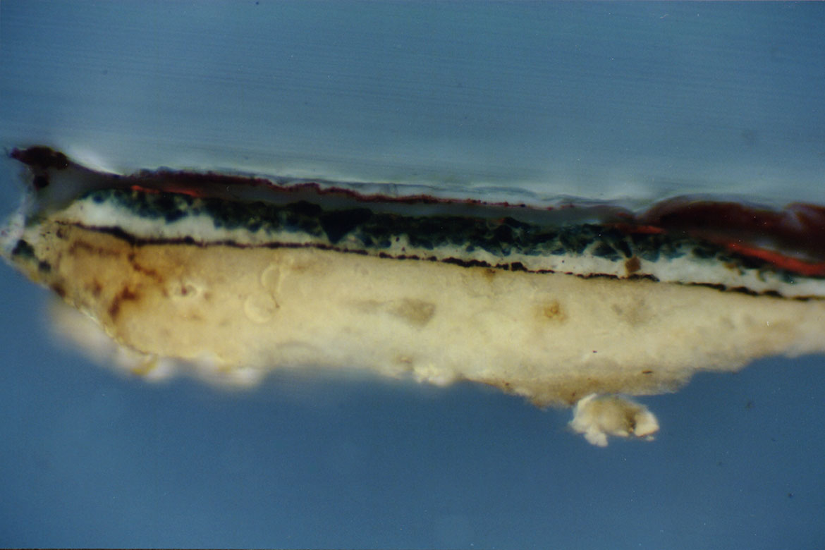
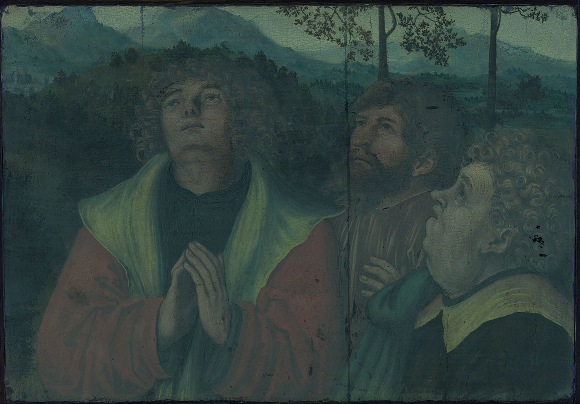
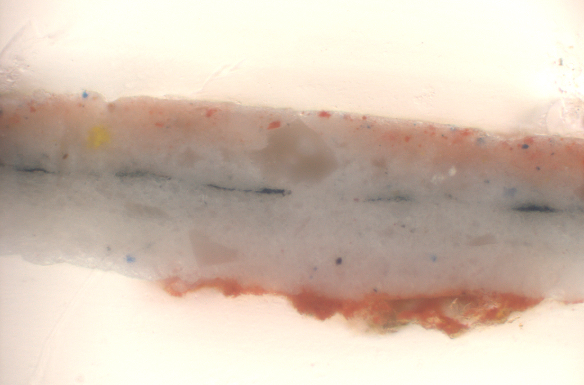
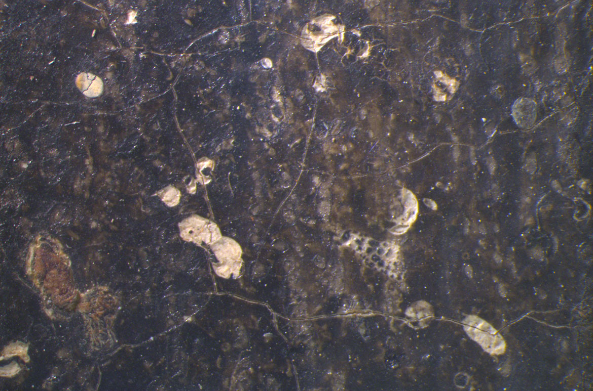
A cross section of paint also illustrates these successive paint layers (Illustrated). Cross-sections are microscopic samples of paint removed from the edge of the painting, embedded in resin and cut to show all of the layers. This paint cross section, taken from a flower near Alice’s shoe, shows many changes in the sequence of paint layers. Looking at the cross section from the base up, we see fragments of the Masonite on which the work is painted, overlaid by the white priming layer. A sequence of more than ten paint layers of different colours follows. The final layers — blue, altered to green, then overpainted with red — complement the evidence of paint layer changes found in the x-ray.
x-ray showing a cross-section of paint

Conservators at QAGOMA have also explored The Blue Alice’s painting materials allowing us to understand the paint technology available to the artist at this specific time and his choices of paint media.
Like many of his contemporaries, Blackman explored the hardware store for art materials because during the late 1940s and 1950s, paints were in short supply and artist paints were expensive. When he started painting around 1949, he used tins of commercial and homemade paints on cardboard and masonite supports 4.
New commercial house paint products were on the market at this time and were advocated by high-profile artists, such as Pablo Picasso and Jackson Pollock. Sidney Nolan was well known for his use of oil-based Ripolin-branded enamel paint from the early 1940s 5 which influenced younger artists like Blackman in his exploration of luminous colour, while Ian Fairweather used water-based house paints from the mid 1950s due to his allergy to oil paint in turpentine 6.
The 1950s also saw an immense exchange of technical information among artists. Blackman describes his relationship with Arthur Boyd as an apprentice to a master, and he learned from Boyd to make his own paint — incorporating homemade paints in his medium around 1952. ‘When I started painting without money I had to make my own colours… all the ‘Alice in Wonderland’ pictures were done with home-made paint’ 7. By handmade, Blackman means that he mixed commercial pigments and binders together himself rather than buying off the shelf colours.
Analysis of microscopic scrapings of paint from The Blue Alice by conservators at QAGOMA has confirmed the artist used predominantly alkyd house paint and tube oils.
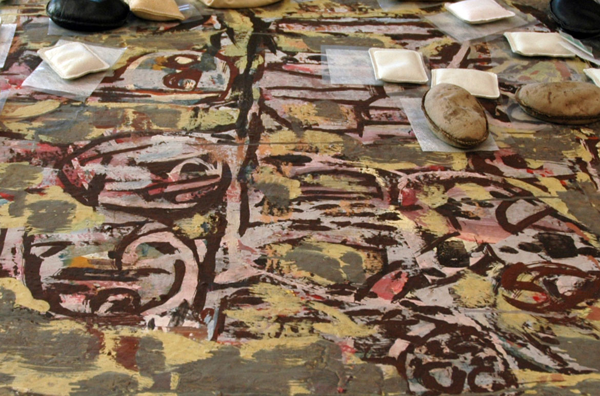
Alkyd house paints are a class of commercial solvent-based paint first developed in the 1920s, and were not available as artist paints until the 1970s. They combine drying oil with polyester resin, which enables the paint to dry quickly. The high oil content means that alkyd paint films have similar characteristics to oil paint, but can be more brittle due to the addition of resin. Alkyd house paint is fluid and generally gives a characteristic smooth, glossy surface devoid of brush marks, as seen in the medium rich titanium white alkyd paint in the white rabbit. (Illustrated) Alkyd is also the medium of the very white petals of some flowers, and here it is likely extended with solvent and bulked out with titanium white pigment, china clay and barium sulphate which makes it very white and matte (Illustrated).
Alkyd house paint in the white rabbit

Alkyd house paint in the white petals of flowers

Tube oil paints, in comparison are thicker and are applied with characteristic ‘impasto’ brush strokes. Impasto is seen in the petals of the flower bouquet Alice is holding (Illustrated). A sample from the white impasto of Alice’s skirt was found to be oil paint with lead and zinc white pigment, characteristic of an artist’s oil paint. These areas of lead white paint can be seen clearly under X-ray as white highlights.
The value of looking more closely at the technique and materials used to make The Blue Alice is that the story of the painting, in addition to the story we see on its surface, can evolve as we look beneath the top paint layers.
Impasto brush strokes in the bouquet


Anne Carter is Conservator, Paintings, QAGOMA
Endnotes
1 Paintings from Alice in Wonderland, Gallery of Contemporary Art, Tavistock Place, 12-22 February 1957.
2 Smith, Geoffrey and St John Moore, Felicity. Charles Blackman: Alice in Wonderland, National Gallery of Victoria, Melbourne, 2006.
3 Shapcott, Thomas W. The Art of Charles Blackman, Andre Deutsch Ltd, London, 1989, p.24.
4 St John Moore, Felicity, Charles Blackman: Schoolgirls and Angels: A Retrospective Exhibition of Paintings and Drawings by Charles Blackman [exhibition catalogue], National Gallery of Victoria, Melbourne, 1993, p.17.
5 Dredge, Paula ‘A history of Australian house paint technology from the 1920s to the 1950s, with reference to its use by Australian artists, particularly Sidney Nolan’, AICCM Bulletin, vol.33, 2012, p.53.
6 Carter, Anne; Osmond, Gillian and Ormsby, Bronwyn, ‘Ian Fairweather and water-based emulsion house paints in Australia 1950–64’, AICCM Bulletin, vol.34, 2014, p.34.
7 Shapcott, Thomas W. The Art of Charles Blackman, Andre Deutsch Ltd, London, 1989, p.24.
#QAGOMA

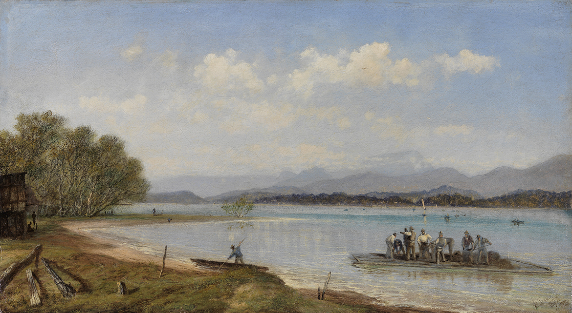
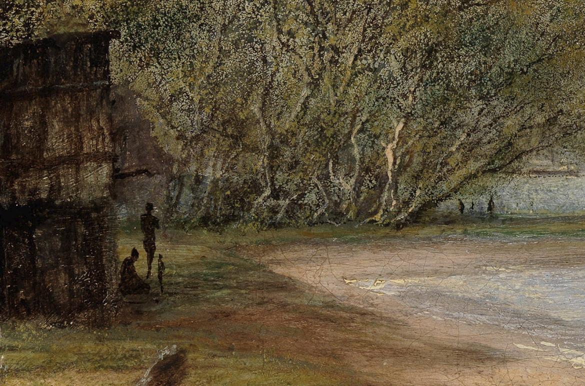
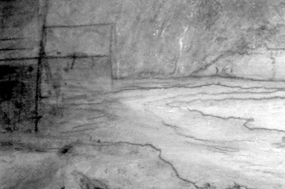
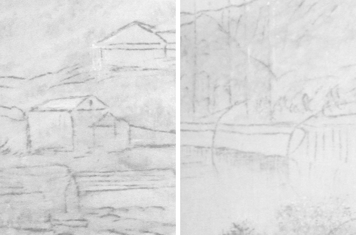
 composite of Isaac Walter Jenner's Hamilton Reach, Brisbane 1885")
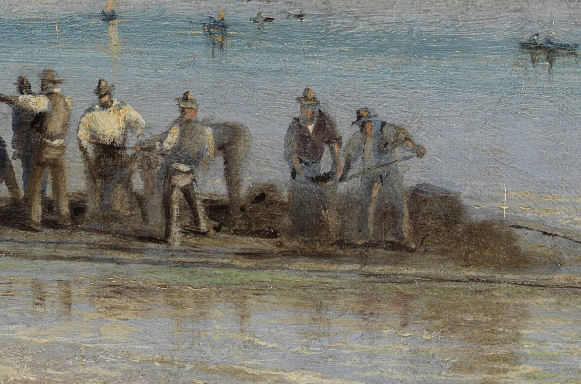
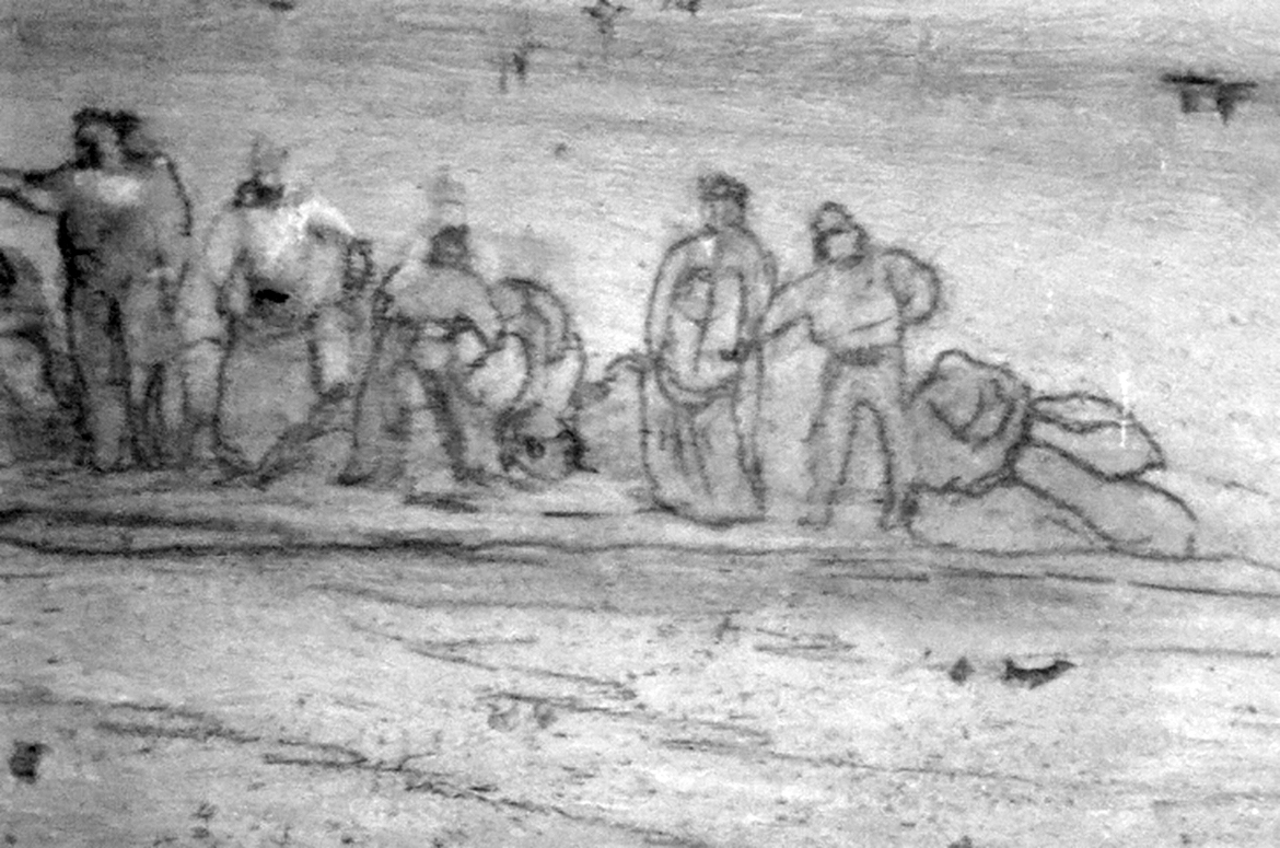
 composite detail illustrating added painted composition which differs to the underdrawing in Isaac Walter Jenner's Hamilton Reach, Brisbane 1885")
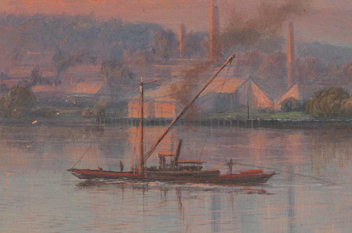
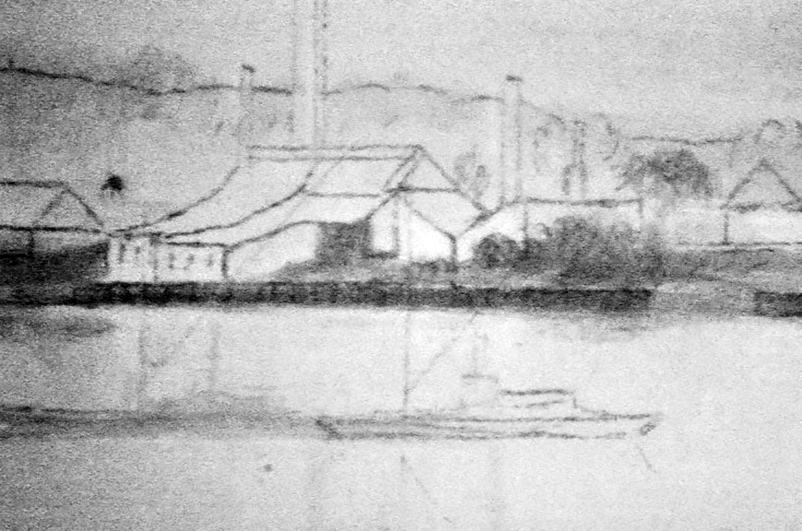
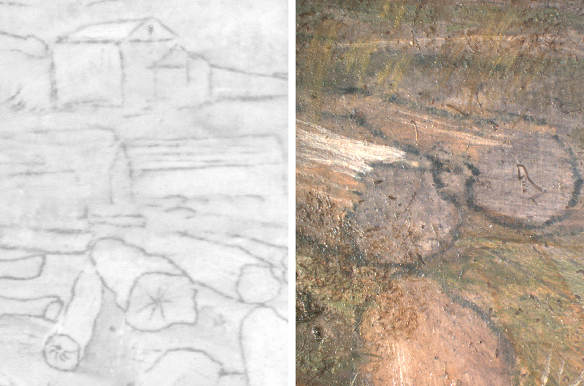
 composite detail of Isaac Walter Jenner’s Queensland natives, the Currigee Oyster Company's Station, Stradbroke Island, Moreton Bay 1897")

 composite detail of fisherman with boat in Isaac Walter Jenner’s Queensland natives, the Currigee Oyster Company's Station, Stradbroke Island, Moreton Bay 1897")

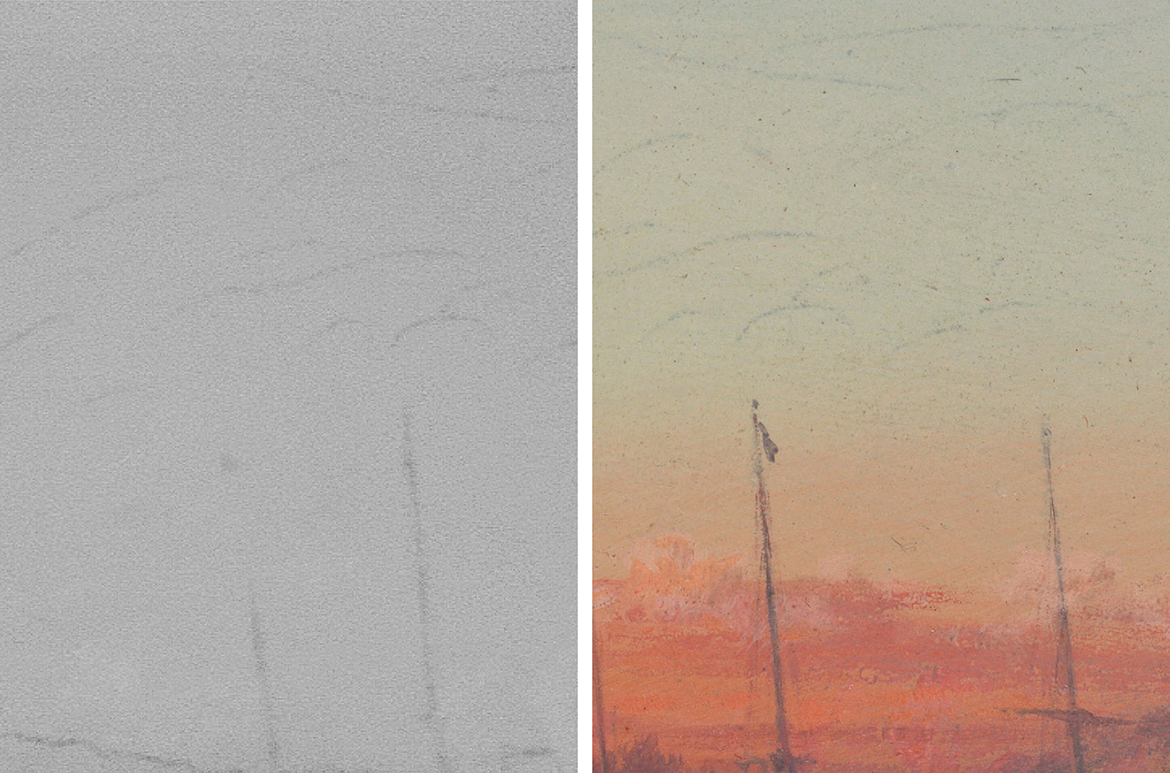


 1893, reworked 1895 / Visible light macro / Photograph: A Carter")
 1893, reworked 1895")
 1893, reworked 1895")


 1893, reworked 1895")
 1893, reworked 1895")


 1893, reworked 1895")
 1893, reworked 1895")
 1893, reworked 1895")
 1893, reworked 1895 / (L to R) IRR; and visible light macro")
 1893, reworked 1895")
 The Great Auk; & Red Throated Loon")
 1893, reworked 1895")
 1893, reworked 1895")
: ‘Chips’ Greensill, attendant/carpenter; William Baillie, attendant; Henry Hacker, entomologist; Eileen Murphy, stenographer; Clarice Sinnamon, librarian; Anthony Alder, taxidermist; Benjamin Harrison, chief attendant; E. Varey, attendant. (Seated L to R): Heber A. Longman, assistant scientist; Ronald Hamlyn-Harris, director; James Douglas Ogilby, ichtyologist. Reclining: Tom Marshall, cadet")


 (Before conservation) c.1895")


 on the left, and then an area where the droppings have fallen off and taken paint with them (right). Residual droppings had to be very slowly and carefully removed so as to not dislodge any more paint during the cleaning process.")


 c.1895")


")